About this artwork
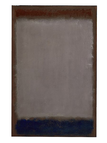
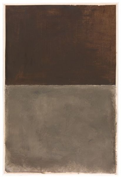
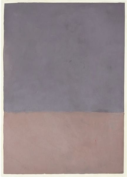
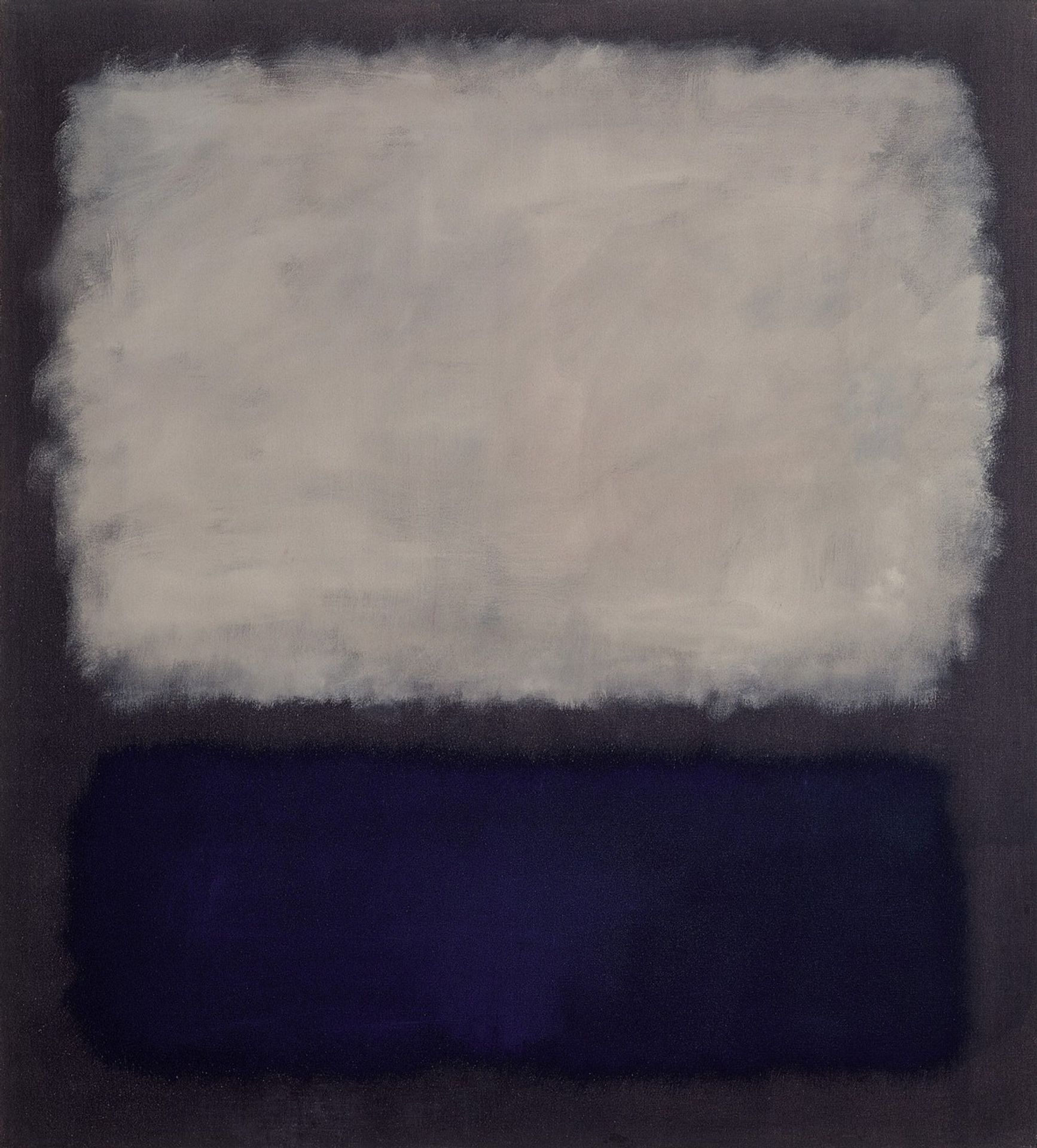
Curator: Before us is "Blue and Gray," a 1962 oil on canvas creation by Mark Rothko. A striking example of abstract expressionism, held here at the Beyeler Foundation. Editor: Instantly, I'm struck by the somber mood, almost melancholic. It feels like staring into a fading twilight, where the boundaries between sky and earth dissolve into a gentle haze. Curator: Rothko's emphasis on colour field painting here allows viewers to engage directly with colour and form, devoid of representational narrative. Note the two horizontal rectangles, blue dominating the lower register and grey occupying the larger upper space. Editor: True, and I think it is compelling. The hazy edges of those blocks almost vibrate against each other. They aren't precise shapes, more like auras softly bleeding into the surrounding grey. Do you get a feeling of instability? Curator: The materiality is key. Oil paint application gives a tactile presence. Brushstrokes are visible upon closer inspection, inviting consideration of artistic processes in the layering. Semiotics and structuralism are clearly evident through his deliberate juxtaposition. Editor: Absolutely, the materiality draws me in. Those hazy edges almost feel breathable, like the colours are living, shifting entities, contained and not contained at once. It reminds me of how memory works, how feeling is so rarely clear cut. Curator: He masterfully captures emotion without literal representation. Consider the philosophical implications. Rothko wanted viewers to feel, not simply see. This reflects existentialist ideas—an individual's search for meaning. Editor: Meaning, or perhaps the acceptance of its elusive nature! It also feels intensely personal. Rothko's paintings become mirrors reflecting the viewer’s own emotional landscape back at them. No two encounters would ever feel alike. Curator: Agreed. The work presents challenges for concrete interpretation, as evidenced. The beauty is that it occupies space outside linguistic meaning, demanding affective experience, prioritizing emotional reception. Editor: It's a powerful example of art's capacity to operate beyond words, tapping into our raw emotionality, presenting two quiet colors as instruments. The quiet feels monumental. Curator: "Blue and Gray" functions as a site for exploring interiority via the visual—demanding engagement from us. Editor: Ultimately, "Blue and Gray" is both an invitation and an introspection into human vulnerability.
Blue and gray 1962
Artwork details
- Medium
- painting, oil-paint
- Location
- Beyeler Foundation, Riehen, Switzerland
- Copyright
- Mark Rothko,Fair Use
Tags
abstract-expressionism
acrylic
non-objective-art
painting
oil-paint
colour-field-painting
abstraction
Comments
No comments
About this artwork
Curator: Before us is "Blue and Gray," a 1962 oil on canvas creation by Mark Rothko. A striking example of abstract expressionism, held here at the Beyeler Foundation. Editor: Instantly, I'm struck by the somber mood, almost melancholic. It feels like staring into a fading twilight, where the boundaries between sky and earth dissolve into a gentle haze. Curator: Rothko's emphasis on colour field painting here allows viewers to engage directly with colour and form, devoid of representational narrative. Note the two horizontal rectangles, blue dominating the lower register and grey occupying the larger upper space. Editor: True, and I think it is compelling. The hazy edges of those blocks almost vibrate against each other. They aren't precise shapes, more like auras softly bleeding into the surrounding grey. Do you get a feeling of instability? Curator: The materiality is key. Oil paint application gives a tactile presence. Brushstrokes are visible upon closer inspection, inviting consideration of artistic processes in the layering. Semiotics and structuralism are clearly evident through his deliberate juxtaposition. Editor: Absolutely, the materiality draws me in. Those hazy edges almost feel breathable, like the colours are living, shifting entities, contained and not contained at once. It reminds me of how memory works, how feeling is so rarely clear cut. Curator: He masterfully captures emotion without literal representation. Consider the philosophical implications. Rothko wanted viewers to feel, not simply see. This reflects existentialist ideas—an individual's search for meaning. Editor: Meaning, or perhaps the acceptance of its elusive nature! It also feels intensely personal. Rothko's paintings become mirrors reflecting the viewer’s own emotional landscape back at them. No two encounters would ever feel alike. Curator: Agreed. The work presents challenges for concrete interpretation, as evidenced. The beauty is that it occupies space outside linguistic meaning, demanding affective experience, prioritizing emotional reception. Editor: It's a powerful example of art's capacity to operate beyond words, tapping into our raw emotionality, presenting two quiet colors as instruments. The quiet feels monumental. Curator: "Blue and Gray" functions as a site for exploring interiority via the visual—demanding engagement from us. Editor: Ultimately, "Blue and Gray" is both an invitation and an introspection into human vulnerability.
Comments
No comments