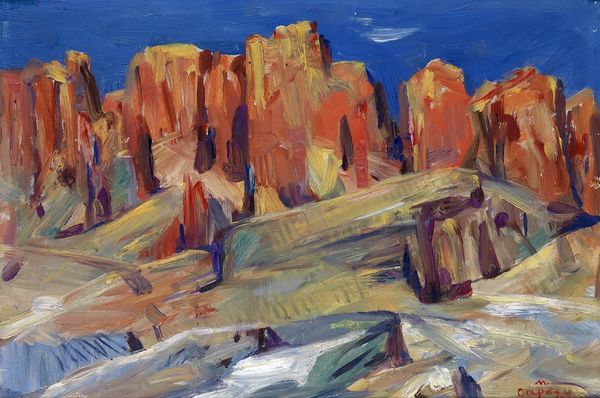
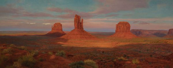
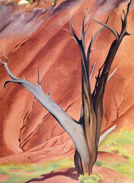
painting, acrylic-paint, impasto
contemporary
painting
landscape
acrylic-paint
impasto
matter-painting
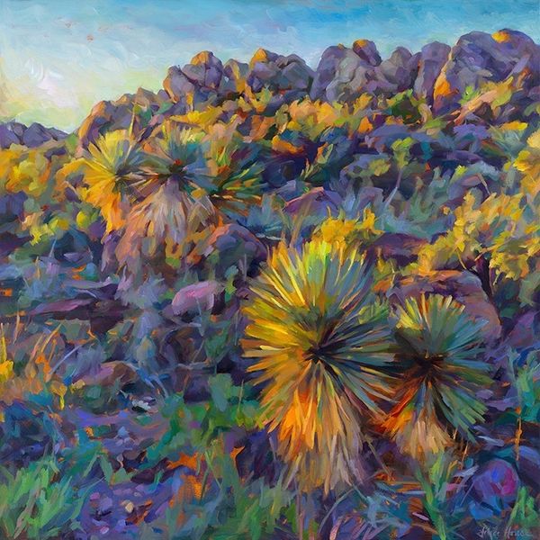
Dimensions: 76.2 x 101.6 cm
Copyright: Erin Hanson,Fair Use
Curator: Standing before us is Erin Hanson’s “Valley of Fire,” an acrylic on canvas completed in 2009. Editor: Well, "Valley of Fire" seems an apt title. The way Hanson renders these rock formations, the chromatic intensity…it nearly vibrates with heat. There's a striking compositional tension between the jagged forms and that relatively smooth, luminous sky. Curator: I'm drawn to how Hanson seems to revel in the materiality of the paint itself. Look at the visible impasto. Each brushstroke is assertive, almost sculptural. The technique draws our attention to the act of creation. Editor: Indeed. I see an interest in exposing process rather than obscuring it. We witness the raw, physical work – the labor involved in translating this landscape. I am left wondering, what paints did Hanson employ and were there additives, gels, mediums used in their mixing to thicken them or create different surface sheen? Curator: She’s certainly challenging any notions of high art versus craft. Hanson focuses on this "open-impressionism" as she terms it, built from distinct mosaic brushstrokes with no blending or glazing. The formal consequence is a vibrant mosaic, a fragmentation that paradoxically unifies the scene. Editor: So we contemplate the work and how the tools and method helped produce it. The loaded brush and tangible nature of layering hues gives heft and a dimensionality to the otherwise flat support. Does this process-oriented, impasto approach evoke a particular period? How does this echo or resist traditions? Curator: It might relate in spirit to certain Post-Impressionist inquiries, but without direct historic quotation. Perhaps Hanson's emphasis is to see color existing materially. This reminds me of a conversation I read once, where Hanson described the work this way "every painting looks like a jigsaw puzzle, fit together precisely with structural color and brush strokes.” Editor: Interesting how that remark foregrounds structure as an aesthetic concept. Hanson uses this materiality as method but it goes hand in hand with that idea, color informs shape, line informs structure. Well, it’s made me contemplate process here, in a whole new way. Curator: For me, the overall unity stems from how the pure hues form this stratified impasto which renders this rugged American landscape with remarkable structural sensitivity. It’s a cohesive effect!
Comments
No comments
Be the first to comment and join the conversation on the ultimate creative platform.