drawing, print, paper, ink
#
drawing
#
aged paper
#
toned paper
# print
#
sketch book
#
landscape
#
paper
#
personal sketchbook
#
ink
#
ink colored
#
sketchbook drawing
#
watercolour illustration
#
storyboard and sketchbook work
#
cartoon carciture
#
sketchbook art
Dimensions: height 103 mm, width 150 mm, height 532 mm, width 320 mm
Copyright: Rijks Museum: Open Domain
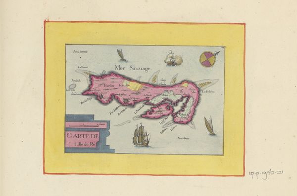
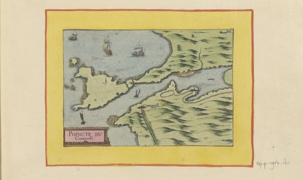
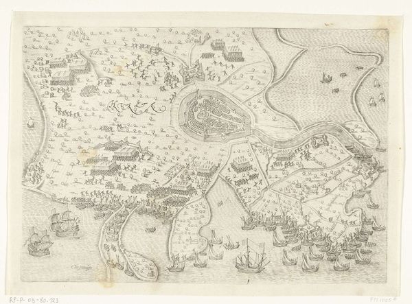
Editor: We're looking at a drawing called "Kaart van l'Île de Noirmoutier," dating back to 1638. It appears to be ink on paper, a kind of early map. The aged paper gives it a delicate, almost fragile quality. How do you read this piece formally? Curator: Immediately striking is the contrast between the precision of the island's representation and the somewhat naive rendering of the ships and surrounding sea. Notice the flat application of color, serving more to delineate form than to create any illusion of depth. Consider also the frame, an integral part of the work; it emphasizes the self-contained nature of this 'world.' How do these elements contribute to the map's overall structure? Editor: It feels like the artist was concerned with representing the island as clearly as possible rather than creating something realistic. The border almost reinforces this as being separate from reality. Curator: Precisely! The lines and shapes dictate our understanding. The use of simple geometric forms—the sails as triangles, the island's shape a segmented whole—invites analysis. Consider the relationship between the textual elements and the pictorial ones; how do they function together to create meaning? Editor: So, it’s less about conveying accurate geography, and more about constructing a visual language of place, right? Even the lettering seems chosen as part of the drawing's composition. Curator: Absolutely. What's more important to observe is how the artist balances detail with abstraction, function with aesthetics. By carefully analyzing its visual components, we unveil not merely a map but a self-contained aesthetic experience. Do you find that looking this way changes how you engage with this work? Editor: Definitely. I now appreciate the map less as information and more as a constructed visual statement. I'll definitely use a formalist approach more often! Curator: And I see the value in appreciating its functional purpose; a synthesis of form and function.
Comments
No comments
Be the first to comment and join the conversation on the ultimate creative platform.
More like this