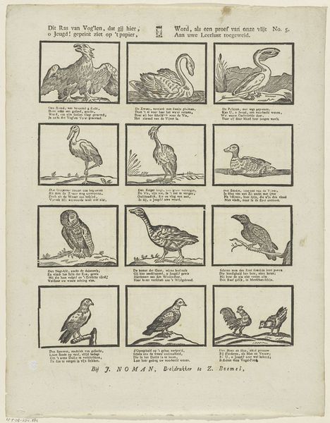
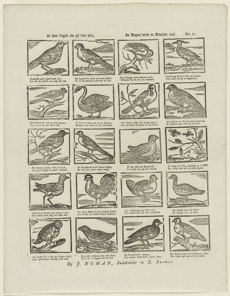
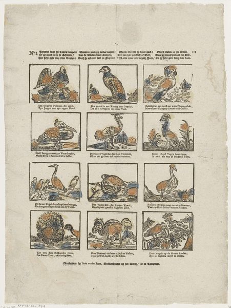
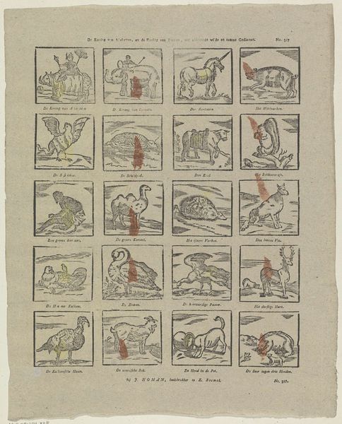
print, etching, engraving
#
comic strip sketch
#
quirky sketch
# print
#
etching
#
sketch book
#
figuration
#
personal sketchbook
#
idea generation sketch
#
sketchwork
#
ink drawing experimentation
#
line
#
sketchbook drawing
#
storyboard and sketchbook work
#
naturalism
#
sketchbook art
#
engraving
Dimensions: height 420 mm, width 335 mm
Copyright: Rijks Museum: Open Domain
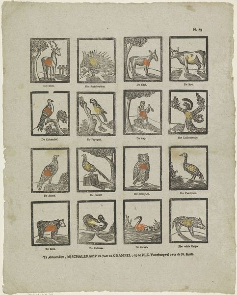
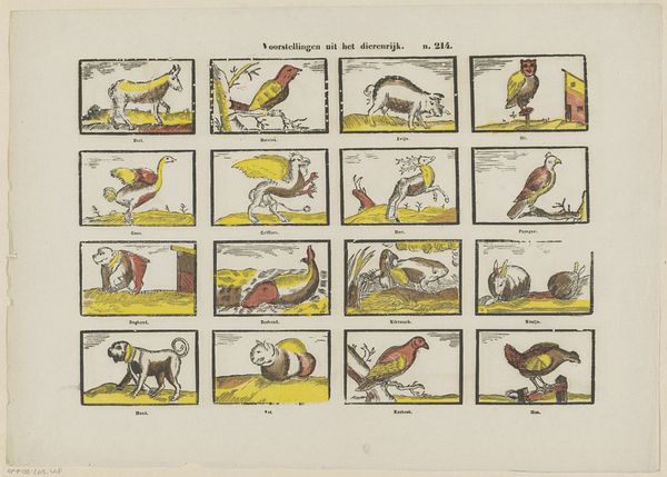
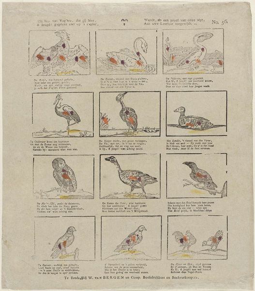
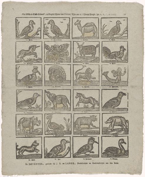
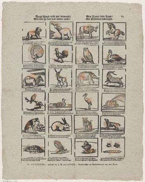
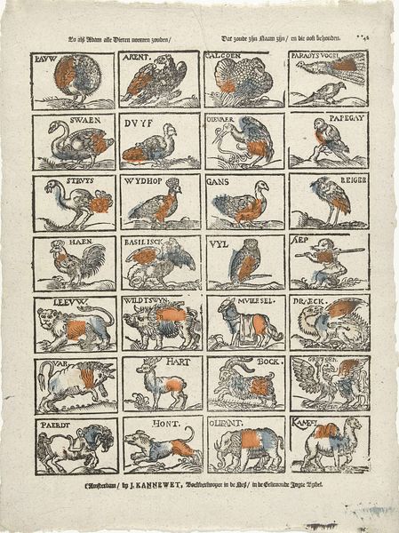
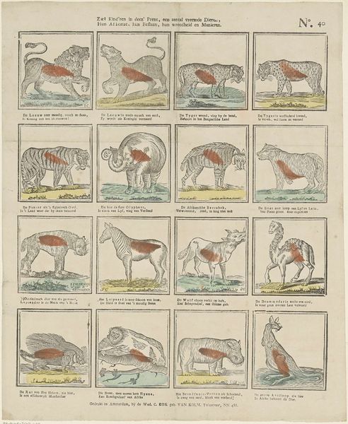
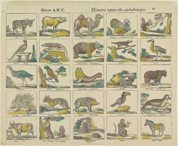
Curator: This print, titled "Dieren," dating roughly from 1822 to 1849, is currently housed here at the Rijksmuseum, created by Mindermann & Co. Editor: It strikes me as both charming and somewhat rudimentary. The collection of animals, each in its little square, feels like a child’s primer or maybe studies from a sketchbook. Curator: It's fascinating to consider it through the lens of material culture. These prints, likely etchings or engravings, were produced en masse by Mindermann & Co. Their Amsterdam workshop would have involved numerous artisans engaged in the labor-intensive process of design and printing. These were commodities, affordable illustrations made possible through developing technologies. Editor: Yes, the repetition lends itself to that idea of mass production. Yet each little vignette is captivating. The line work, while simple, captures the essence of each creature—the swagger of the lion, the sinuous curve of the snake, the awkward grace of the camel. Formally, the consistent framing gives unity despite the diversity. Curator: Think about the societal function. Who was purchasing these prints and why? Were they for educational purposes, a glimpse into the wider world of nature, or perhaps decoration in modest homes? The means of distribution tell as much of a story as the images themselves. It brings the natural world into Dutch homes as a display object of the period. Editor: I wonder about the specific animal choices, though. Is there some symbolic weight beyond just wanting to illustrate ‘animals’? There’s a parrot, caged and perched—is it just to present ‘parrots’, or is the constraint suggestive of ideas about domesticity? Curator: Precisely! These are products embedded within their historical and cultural context. Their construction is as critical as the visual interpretation. And let’s not forget the addition of names beside each drawing in Dutch, "hond," "leeuw", or "zwaan", solidifying its pedagogical, popular appeal in their social environment. Editor: Ultimately, the arrangement feels pleasing and very readable. A fine set of specimens that has historical weight for all kinds of reasons. Curator: Yes, it demonstrates perfectly how popular knowledge and aesthetic taste were actively shaped through visual production and consumption during this period.
Comments
No comments
Be the first to comment and join the conversation on the ultimate creative platform.
More like this