Dimensions: height 155 mm, width 100 mm
Copyright: Rijks Museum: Open Domain
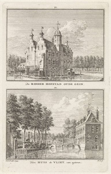
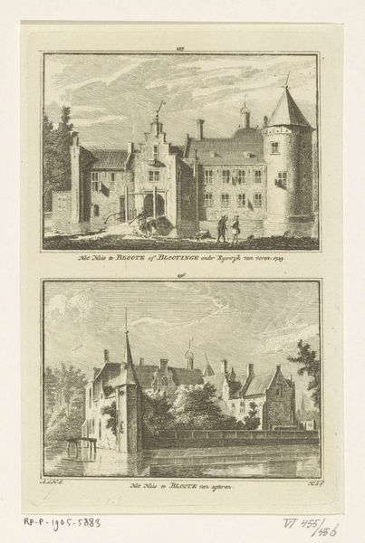
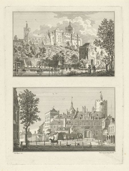
Curator: Welcome to this gallery. Before us is "Gezicht op kasteel Rijnestein en kasteel Rijnenburg" created in 1773 by Hendrik Spilman. It's a meticulously crafted print, an engraving depicting two estates. Editor: Immediately striking is the tranquil atmosphere, almost dreamlike. The buildings reflected in the water, a sense of established authority tempered by peaceful isolation. Curator: Spilman's choice of engraving is fascinating. The linear precision allows for incredible detail, but also speaks to the economics of image production at the time. Engravings like these were reproducible, disseminating images of status and property widely. It’s a form of visual branding. Editor: And yet, those formal choices lend such emotional weight. Notice how each estate sits framed by water—both are like islands unto themselves, with strong symbolic separation from their surrounding community and asserting their wealth and elevated rank. Curator: I see the practical aspects of showcasing land ownership. Consider the paper it’s printed on. Its texture, weight, the cost of the ink… Every element would signal value, care, and access to specialized materials. These weren't casual doodles, but pronouncements. Editor: Perhaps. The Baroque architecture also hints to me at stability, and divine favor as each towers over its surroundings with pride. The towers remind me of religious spires reaching towards heaven—as a blessing or a show of self importance? Curator: That is an interesting viewpoint to suggest. Perhaps, what is more interesting is to observe Spilman's skill, especially capturing these detailed architectural drawings within the confines of printmaking during this time. Each line is purposeful, showing a specific approach and commitment. Editor: I suppose both are valid in their own ways. Visual symbols are meant to mean different things and make us wonder and engage. I feel that Spilman truly succeeded in capturing the nuances of power during that period in time. Curator: I am equally moved by the understanding of the economics of material production and the artistic talent shown by Spilman within the context of that. Editor: In either case, it’s hard to deny the staying power of symbols when expertly applied by an artist like Spilman. Curator: True, true. Perhaps it makes us contemplate how seemingly disparate viewpoints contribute towards something richer in understanding!
Comments
No comments
Be the first to comment and join the conversation on the ultimate creative platform.
More like this