print, engraving
#
portrait
# print
#
old engraving style
#
portrait reference
#
history-painting
#
academic-art
#
engraving
#
realism
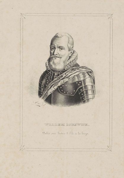
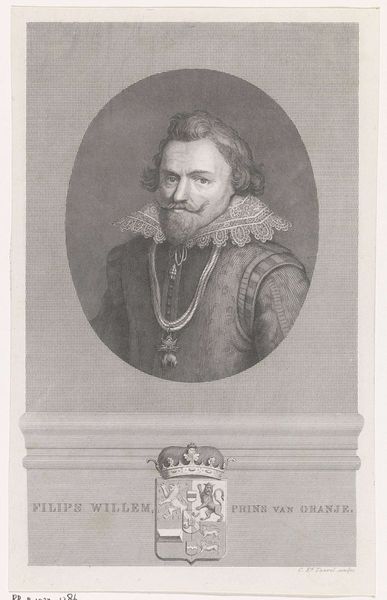
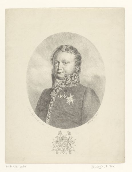
Dimensions: height 196 mm, width 128 mm
Copyright: Rijks Museum: Open Domain
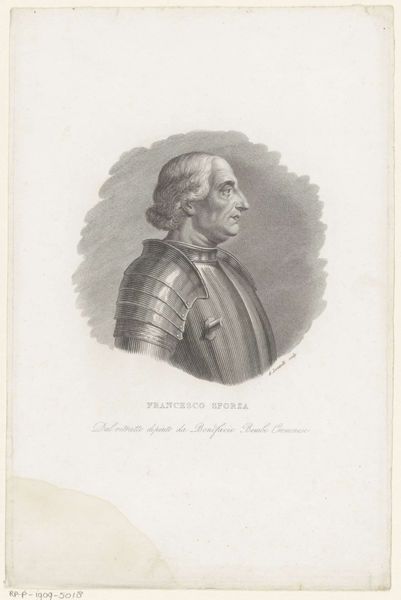
Editor: We're looking at a print entitled "Portret van Filips Willem, prins van Oranje," created around 1834-1840 by Monogrammist AVV. It’s an engraving and is currently held at the Rijksmuseum. It feels quite formal to me, very academic in its rendering of details like the lace collar and the textures in the face. What stands out to you from a formal perspective? Curator: The piece is demonstrative of the engraver's mastery over line and tone. Consider the use of hatching and cross-hatching to define the planes of the face and to create the illusion of depth within the figure’s armour. It's this sophisticated application of technique that articulates both form and texture. Also observe the symmetrical structure; what purpose do you believe that serves in portraiture such as this? Editor: I guess the symmetry lends an air of formality and stability, reflecting perhaps the subject's status and authority. Do you think the sharp contrast enhances the realism? Curator: The dramatic contrasts certainly heighten the visual impact. But more than realism, consider the construction of form. See how light and shadow, or the stark juxtaposition between them, contribute to the overall visual dynamic, creating a potent aesthetic experience. Note, too, the rigid frame versus the softness in the portrait rendering. The semiotic tension there enhances the artwork's ability to be compelling to this day. Editor: That’s really interesting. It’s helped me see beyond the simple representational aspect to appreciate the complex interplay of artistic techniques at play here. Curator: Precisely. Looking past representation unlocks an understanding of the visual language itself.
Comments
No comments
Be the first to comment and join the conversation on the ultimate creative platform.
More like this