1968
False Image Postcards
Listen to curator's interpretation
Curatorial notes
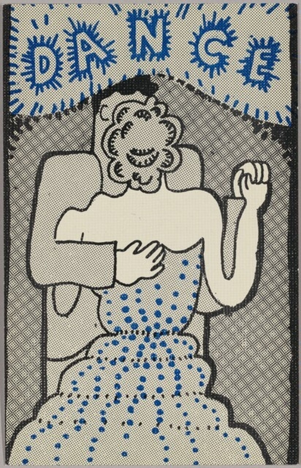
Here we have Philip Hanson's "False Image Postcards". It's this peculiar little scene, probably from a photograph, remade using graphic techniques. The bold outlines, halftone shading, and those bright blue polka dots all conspire to create something that feels both familiar and strangely unsettling. It looks like an etching, or maybe a print? What’s so captivating about this piece is the way it embraces its own artificiality. The color palette is minimal, but the contrast is striking. The way the blue pops against the off-white background is so compelling. Look at how Hanson uses the halftone dots to suggest depth and shadow. They almost vibrate on the surface, creating a kind of optical illusion. It's like a glitch in the matrix, isn't it? The word "DANCE" hovers above the couple, like a command or a promise. I love how Hanson takes something as seemingly simple as a postcard and turns it into a space for questioning, for imagining, and for challenging our assumptions about what art can be. Reminds me of work by Christina Ramberg.