Copyright: CC0 1.0
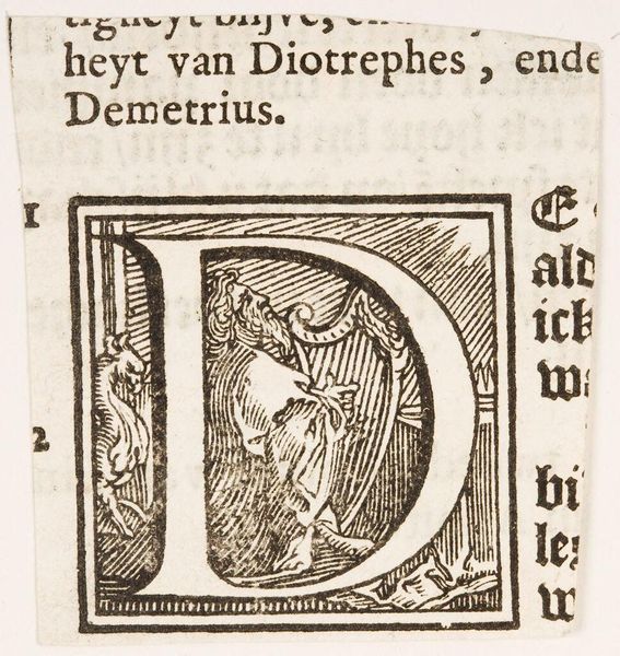
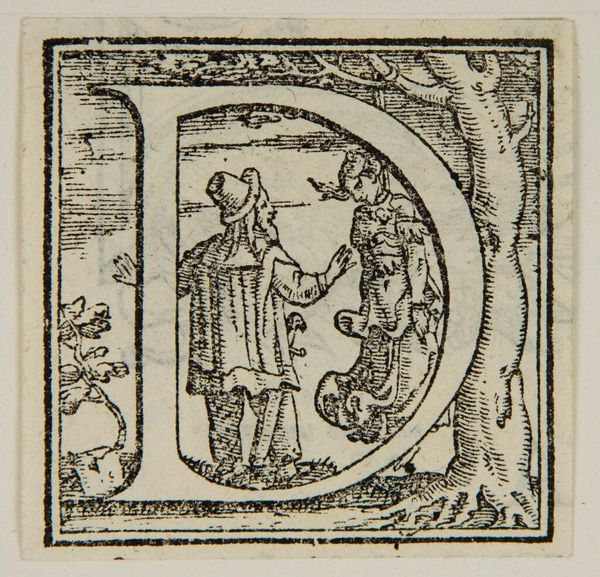
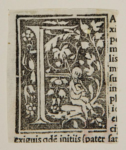
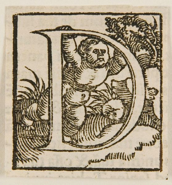
Editor: This is a small print called "Initial D" by an anonymous artist. The stark black and white and the dense lines make it feel quite powerful. What do you see when you look at the form and texture in this print? Curator: The stark contrast emphasizes the form of the letter "D," which is further elaborated by the interior figures. Note the interplay between line density and negative space; how does that articulation guide your eye? Editor: It moves my eye around the letter in a circular motion, from the mother and child to the leaves. So the rhythm is internal to the form itself? Curator: Precisely. The visual elements establish a self-contained, semiotic structure, quite apart from any narrative consideration. Does that change your perspective? Editor: It helps me appreciate the design and how it carries the artistic intention. Thanks!
Comments
No comments
Be the first to comment and join the conversation on the ultimate creative platform.
More like this