paper, ink
#
narrative-art
#
comic strip
#
pen illustration
#
paper
#
ink
#
early-renaissance
#
street
Copyright: Public domain
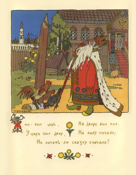
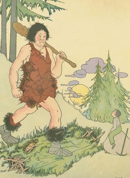
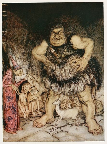
Editor: We're looking at Heorhiy Narbut's "Illustration for the book of B. Dix 'Toys'," created in 1911 using ink on paper. What strikes me immediately is the stark contrast between the enormous, somewhat grotesque figure looming over the quaint, almost miniature town. How would you interpret this juxtaposition? Curator: Indeed. Let us focus first on the visual construction. The image plane is divided rather distinctly. Note how the foregrounded figure, rendered with a dense, almost chaotic line work, dominates the composition. This textural richness is juxtaposed with the simplified, linear rendering of the town below. The formal elements—the stark tonal contrast, the division of space, the variation in line quality—establish a visual hierarchy. What do you think the artist is attempting to convey through these formal choices? Editor: Perhaps it's a commentary on scale and perspective, like a child's imaginative world brought to life? Or a critique of traditional representation by exaggerating the main subject? Curator: A relevant reading. Consider also the early Renaissance influence evident in the composition, yet disrupted by the decidedly un-classical figure. This tension between artistic traditions generates visual interest, suggesting a re-evaluation, perhaps even a deconstruction, of aesthetic conventions. Do you agree? Editor: I see what you mean. The traditional elements create a kind of base, which then gets disrupted by this, as you mentioned, decidedly strange figure, resulting in an uncanny aesthetic. Thank you for the explication. I'm starting to understand how a careful attention to form and structure can reveal underlying meaning. Curator: Precisely. By examining the artist's formal decisions, the organization of the visual elements, we can unlock deeper layers of significance.
Comments
No comments
Be the first to comment and join the conversation on the ultimate creative platform.
More like this