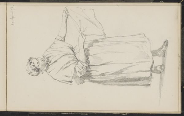
drawing, pencil
portrait
drawing
pencil
realism
Copyright: Rijks Museum: Open Domain
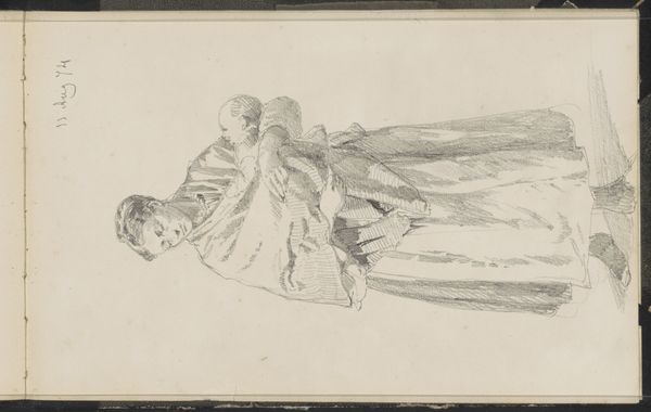
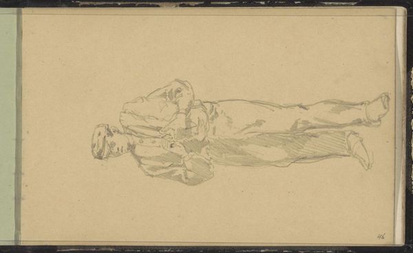
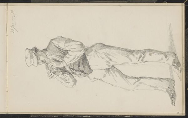
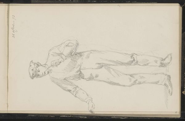
Editor: Here we have Cornelis Springer’s “Man met een pet,” created around 1863 using pencil. I’m struck by the dynamic energy in this sketch despite the simple lines and limited shading. What compositional elements stand out to you? Curator: Immediately, the strategic use of line dictates our reading. Notice the almost frenetic energy in the upper torso compared to the legs; what does that juxtaposition achieve, in your opinion? It pulls us between these disparate visual weights, yes? Editor: I hadn’t thought about the difference in energy between the upper and lower parts. It's almost as if the artist wants us to question where to focus, adding to the work’s complexity, despite its apparent simplicity. Curator: Precisely. Moreover, consider the negative space. How does Springer employ it, and how does it impact the viewer's engagement with the piece's themes? Editor: Well, the figure isn't centered. By placing it to the upper-left, Springer creates a sense of implied motion, or perhaps isolation. There’s a sense of the figure adrift. Curator: A keen observation! And it is further enhanced by the lack of background detail. Our eye struggles to settle; that, I posit, is entirely intentional. This masterful arrangement of lines, shapes, and spatial relationships results in tension and imbalance. Editor: So, even a simple sketch can be deeply complex when we look at the pure design and arrangement of forms. Curator: Indeed. Springer's piece proves that impactful art isn’t always about intricate detail.
Comments
No comments
Be the first to comment and join the conversation on the ultimate creative platform.