drawing, paper, ink
#
pencil drawn
#
landscape illustration sketch
#
drawing
#
pencil sketch
#
landscape
#
paper
#
ink
#
pencil drawing
#
pen-ink sketch
#
watercolour illustration
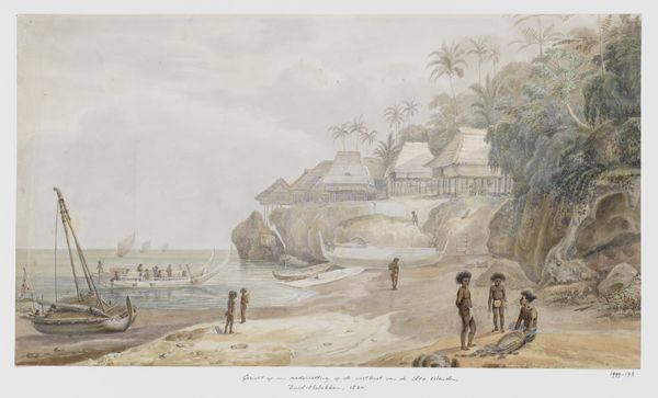
Dimensions: height 27.6 cm, width 38.3 cm
Copyright: Rijks Museum: Open Domain
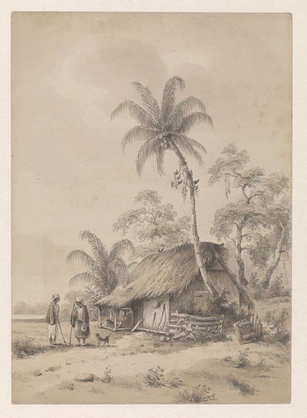
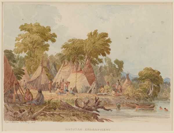
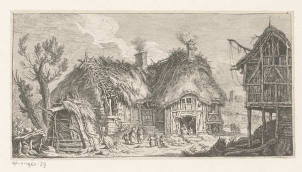
Curator: This is an intriguing scene in pencil and ink wash, titled "Kamp van de Arowakken of Caraïben", attributed to Hendrik Huygens, made sometime before 1859. Editor: There's a muted stillness to this piece. The artist uses the wash delicately, creating a rather dreamy atmosphere, yet the figures offer a sense of focused activity. Curator: Absolutely, it’s important to note how Huygens constructs the composition. Observe the materials used for the dwellings. The thatch and timber tell us about resourcefulness and the interaction between the Arawak people and their immediate environment. The very process of erecting these structures speaks to community effort and practical skills. Editor: Yes, the texture is remarkably detailed, almost hyperrealistic in parts, yet still delicate and precise. The shading suggests a careful observation of light. The overall impression is very peaceful but somewhat removed; we're observing from a distance. The huts act as framing devices, offering selective views of human activity. Curator: Considering the broader social and historical context, Huygens likely created this piece as part of a colonial project to document the ‘exotic’ cultures of the Americas. His choice of medium—portable and relatively inexpensive—would have facilitated the swift recording of observations made during expeditions. This challenges the Western perception of landscape art: we need to acknowledge this not just as aesthetics but as visual records with social meaning. Editor: From a formal standpoint, I appreciate the tonal unity he achieves with such limited means—variations in shading giving form and volume to a flat surface, building spatial depth layer by layer. Curator: I think reflecting on Huygens’ probable status and perspective is crucial for a more responsible analysis of the artwork. Acknowledging that it likely was made to promote a biased, ethnographic perspective, helps us appreciate what lies between the lines. Editor: Quite. Despite my appreciation for the rendering, it’s wise to recall art-historical contextual factors—thank you for emphasizing the complexities.
Comments
No comments
Be the first to comment and join the conversation on the ultimate creative platform.
More like this