carving, print, metal, engraving
#
carving
# print
#
metal
#
asian-art
#
geometric
#
line
#
history-painting
#
engraving
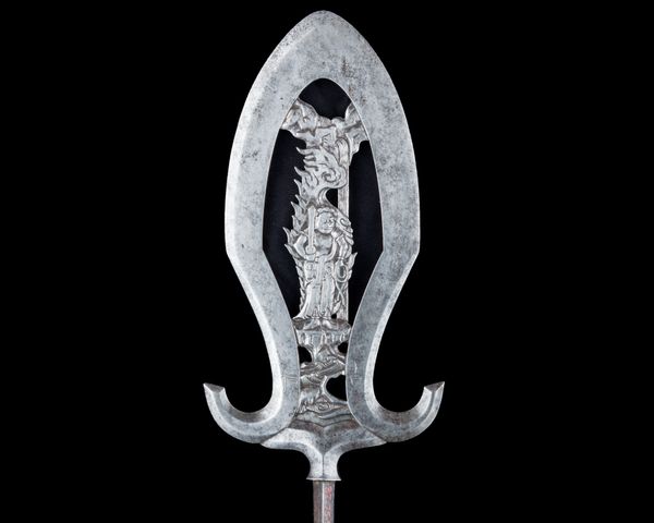
Dimensions: L. 8 3/8 in. (21.3 cm); L. of head 2 7/8 in. (7.3 cm); W. 1 5/16 in. (3.3 cm); Wt. 0.75 oz. (21 g)
Copyright: Public Domain
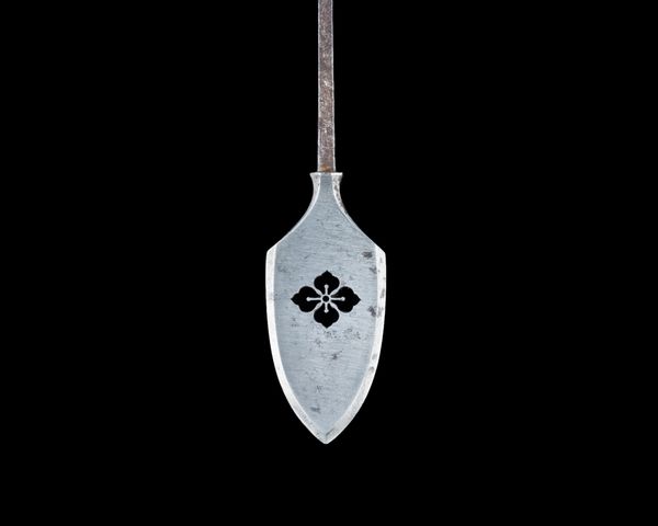
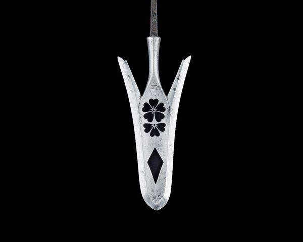
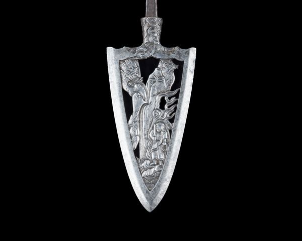
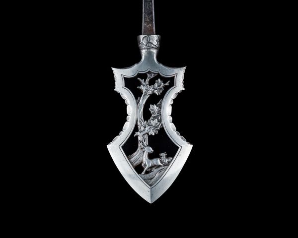
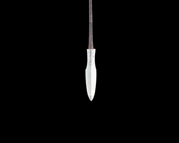
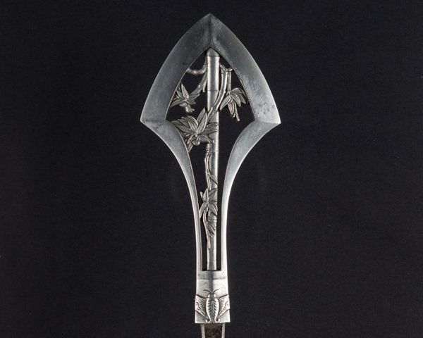
Curator: Here we have "Arrowhead (Yanone)," a compelling metal engraving dating sometime between 1501 and 1900. Editor: Striking. The crisp lines create a fascinating play of negative space against the solid metal. The stylized floral motif feels surprisingly modern despite its age. Curator: Indeed. Let's consider the materiality of the piece. This wasn’t merely sculpted; it was engraved, a painstaking process involving sharp tools to cut away material and reveal the design. The labor itself becomes part of its meaning, does it not? We must question the accessibility of metal crafting like this for the ordinary populace and imagine how the social status of those consuming this product were changed. Editor: The choice of metal, too, would speak to its intended function and status. I find myself intrigued by the composition—the symmetrical design, contained within the shield shape, evokes a sense of formal order. The symbolic contrast is particularly potent, especially the tiny heart below the geometric rose-like shape. Curator: It does feel deliberately constructed. Semiotically, the arrow shape implies direction and force, further highlighting the intention of use while still offering itself as a decorative pattern. This raises fascinating questions about historical functionality. Is this art or design, and can we be sure where to place this artifact with only a superficial view? Editor: Perhaps both? The object blurs the line beautifully. We cannot ignore its obvious purpose. The artisan imbued a functional item with aesthetic considerations beyond mere utility, as a visual language for all its end-users. Curator: Very well said! I hadn't considered the visual language so thoughtfully. The stark contrast between the dark background and polished metal allows the viewer a deeper exploration of the work's form and line work as well. Editor: Yes, that’s why the elegance of that heart feels so sharp in a way—both are juxtaposed and exist in this utilitarian artifact. What stories could such an object tell if only it could!
Comments
No comments
Be the first to comment and join the conversation on the ultimate creative platform.
