drawing, paper, ink, architecture
#
drawing
#
perspective
#
paper
#
form
#
11_renaissance
#
ink
#
geometric
#
cityscape
#
architecture
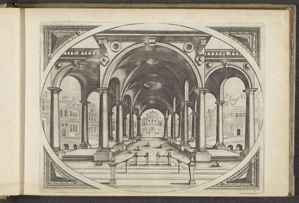
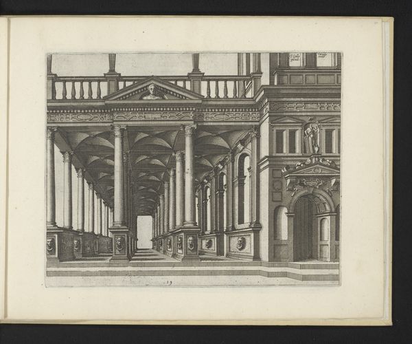
Dimensions: height 164 mm, width 215 mm
Copyright: Rijks Museum: Open Domain
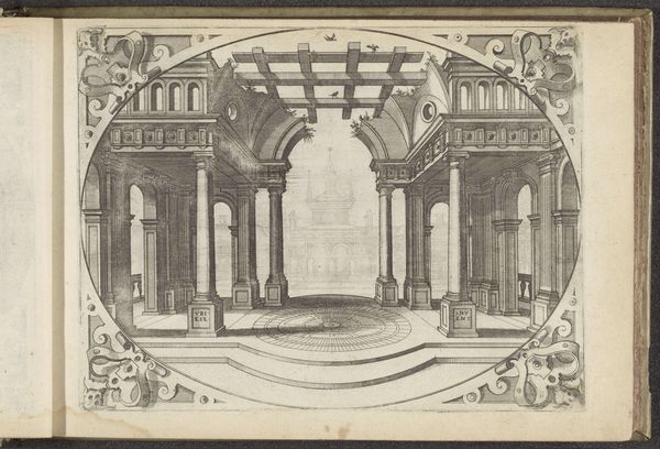
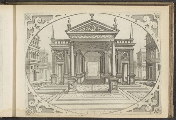
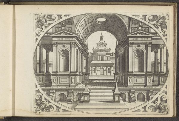
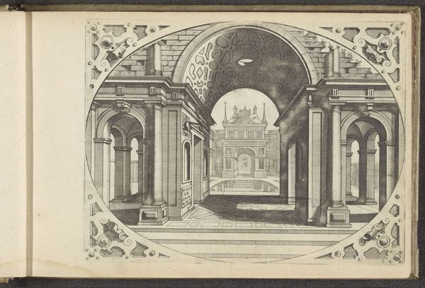
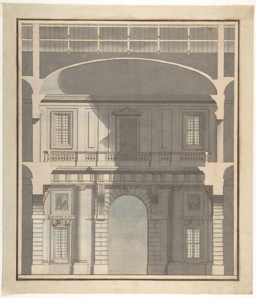
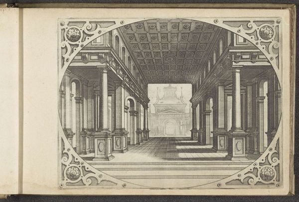
Curator: This detailed ink drawing is entitled “Dubbel portiek bekroond met een fronton,” or “Double porch crowned with a pediment,” created sometime between 1560 and 1601 by Johannes or Lucas van Doetechum. Editor: It has a certain imposing stillness to it, doesn't it? The rigid geometric lines and perspective almost give it a stage-like quality, or maybe even a blueprint for a monumental theater design. Curator: Absolutely. Drawings like these, and the prints made from them, circulated widely in the Netherlands during the Renaissance, and played a pivotal role in shaping architectural tastes and civic ambitions. Editor: Notice how the lines converge perfectly, creating depth? The repeating arches and columns give the image a powerful sense of order, while the ornate decorations around the edges enclose and isolate the inner design, forcing us to really concentrate on it. Curator: The strategic deployment of perspective underscores the importance of humanism in Renaissance culture. Architectural drawings like this reflect not only artistic skill but also new philosophies regarding human scale and order in the universe. Patrons saw themselves mirrored in this art. Editor: I'm fascinated by the rendering of light and shadow; it lends an ethereal quality to the drawing, even though the scene itself feels so rigidly architectural. Did the social context of artistic production alter given the time period and themes? Curator: Without a doubt, Johannes and Lucas van Doetechum were key figures in disseminating visual ideas in the Netherlands. As printmakers, their workshop would have produced images accessible to a broader audience. Editor: The material properties too—the fineness of the ink lines, the smooth paper texture. The starkness makes it very thought provoking to consider the intention of the artist to engage the observer’s mind on themes of order and shape. Curator: Well, thinking about it from a formalist point of view and the Renaissance perspective has enriched my historical approach here. Editor: And examining it from the viewpoint of art’s institutional role encourages deeper understanding of form, and its impact in art.
Comments
No comments
Be the first to comment and join the conversation on the ultimate creative platform.
More like this