drawing, print, woodcut
#
portrait
#
drawing
# print
#
pen illustration
#
old engraving style
#
woodcut
#
symbolism
Dimensions: height 284 mm, width 209 mm
Copyright: Rijks Museum: Open Domain
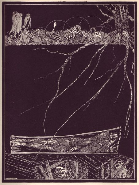
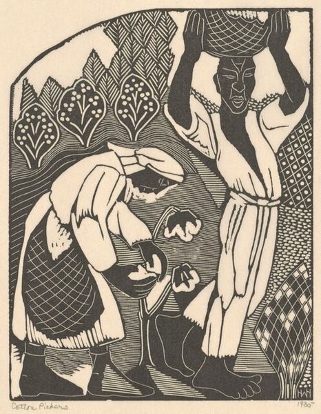
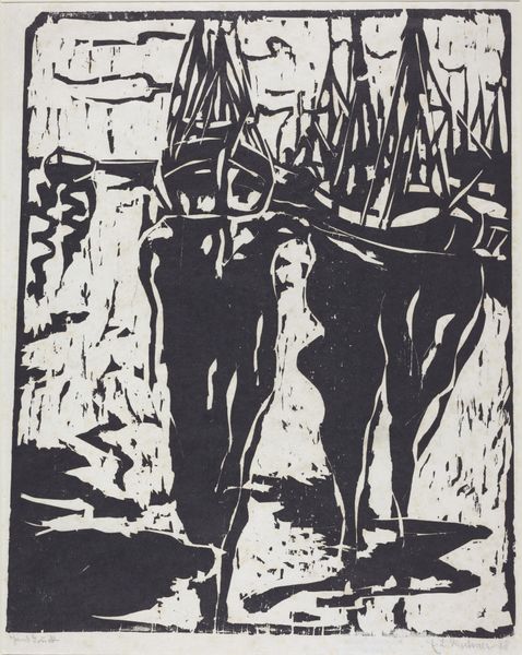
Ferdinand Oldewelt made this design for W.F.H. Oldewelt’s bookplate in 1914, probably using a woodcut or linocut technique. It’s a study in contrasts – black and white, solid form and delicate detail. Look at how the black ink defines the figure of the reader, huddled in thought, while the white spaces create a sense of light and landscape around him. I love the way the artist used the starkness of the medium to evoke a mood of quiet contemplation. The texture is amazing; you can almost feel the grain of the wood or the smoothness of the linoleum. It makes me think about process, of the artist carving away, making deliberate choices about what to reveal and what to conceal. The whole image has this wonderful balance between detail and abstraction, something that reminds me a bit of the graphic work of someone like Emil Nolde, who also embraced the expressive potential of black and white. I think this is a piece that reminds us that art isn’t about perfect representation. It’s about creating a conversation, an invitation to look and think.
Comments
No comments
Be the first to comment and join the conversation on the ultimate creative platform.
More like this