studio photography
product shot
antique finish
brand image
old engraving style
product fashion photography
woodcut effect
retro 'vintage design
embossed
golden font
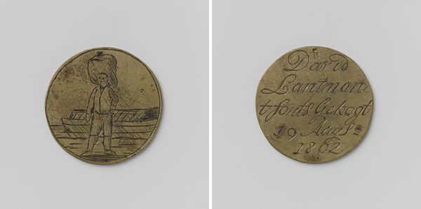
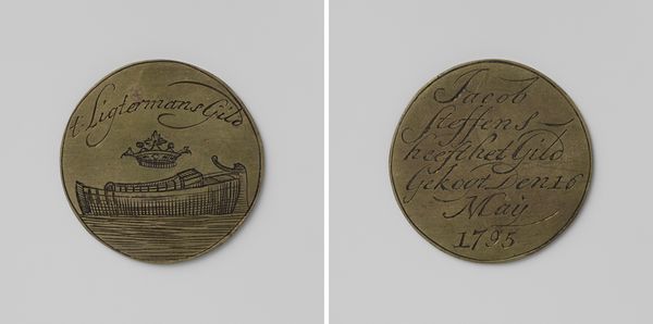
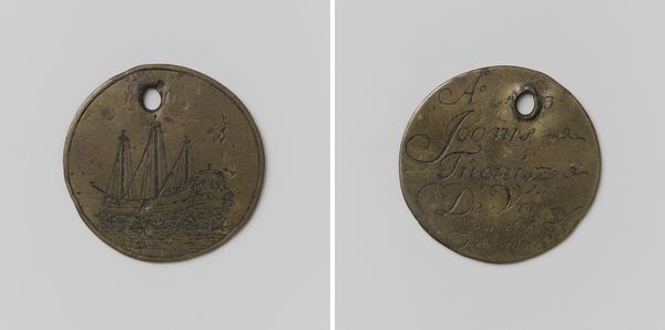
Dimensions: diameter 3.2 cm, weight 78 gr
Copyright: Rijks Museum: Open Domain
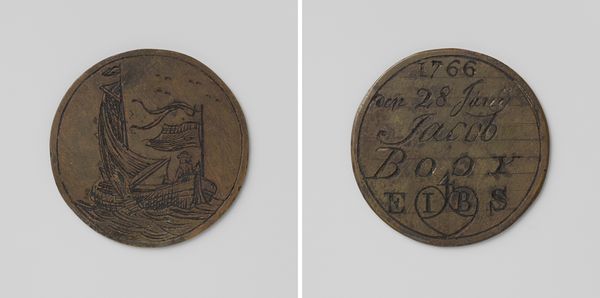
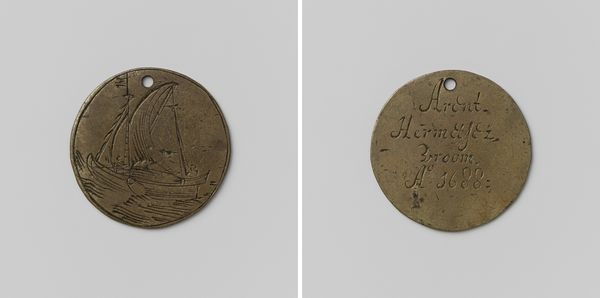
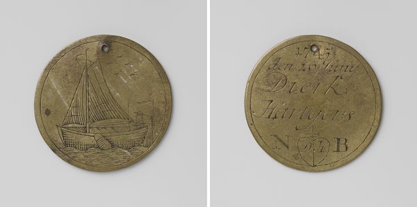
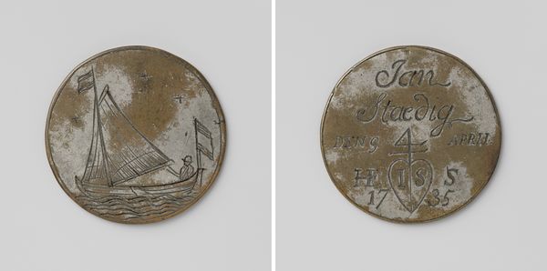
Curator: Here we have a closer look at "Schippersgilde, gildepenning van Wormer Jansen," a piece dating back to 1703. It's a fascinating example of early 18th-century craftsmanship. Editor: Right away, there's a charm to the simplicity of this coin or medal. It’s rugged, in a way, you know? Like it's weathered a few sea journeys itself. Curator: Indeed. Formally, the piece presents a duality, with two distinct sides offering different visual languages. One face presents the namesake of the work and its associated date of creation while the other has the ship floating on the waves, but also perhaps representing the identity and professional belonging of the subject Jansen. Editor: That ship side really grabs me. It feels like it was sketched during a particularly restless voyage. The waves practically vibrate. It would feel special if I received this at the time, like being brought into the group. Curator: It also reveals the relationship between craftsmanship and symbolism of the era, capturing a key part of Dutch society back in the day: Commerce and sea trade! Consider the materiality – the touch, the weight... Editor: Which I guess, to be fair, would also have something to do with belonging and prestige and commerce all at once. Did everyone get these or only the fanciest members of the guild? Curator: We don't know exactly about its status within the guild's structures of hierarchy but we can surmise this object was intended as a commemorative piece meant to represent belonging and status. Its aesthetic draws inspiration from classical art of that period yet remains unique in the way the images are positioned on the coin’s face. Editor: Looking at both sides...they create such an echo with one another, almost a yin and yang in miniature...balancing artistry and everyday experience! It definitely transcends being just a coin and speaks of human stories on the sea! Curator: Precisely. The artist creates a holistic representation through a skillful application of lines. In terms of semiotics, both imagery, combined, function as indexical signs, referencing maritime trade and professional belonging while working as an iconic sign when reflecting maritime activity! Editor: A tiny testament to the human endeavor and the open sea, neatly tucked into a simple design! It speaks volumes beyond the obvious... and on multiple levels! It is inspiring indeed.
Comments
No comments
Be the first to comment and join the conversation on the ultimate creative platform.