Copyright: Public domain
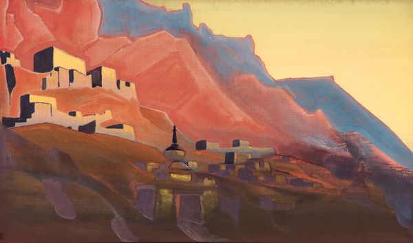
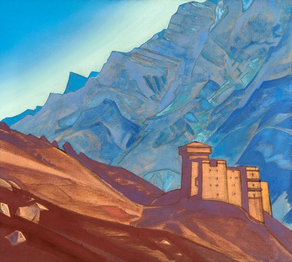
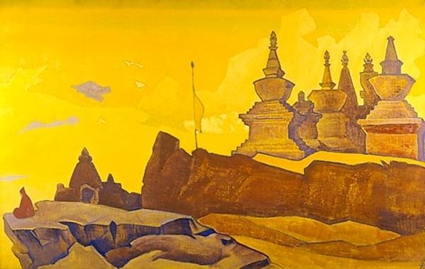
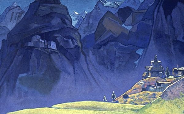
Nicholas Roerich painted "She Monastery" with what looks like tempera, and it's all about how he layers color to build form. There’s a soft, dreamlike quality to the way the light catches the stupa, that central, dome-like structure. Notice how the colors aren’t blended so much as they sit side by side; it's like Roerich is letting each shade hold its own space, which gives the whole scene a vibrating sort of energy. The texture isn’t about thick paint, but about the relationships between colours, the violet hues against the sky blue. Look at how the mountains in the background are treated almost like geometric shapes, stacked and overlapping, which create depth and invite you to look deeper into the picture. Roerich was into the spiritual side of art, and you see that in his peaceful, contemplative landscapes. I’m reminded of Milton Avery, who also knew how to make simple shapes sing. These artists show that art is always a conversation, and there's no right or wrong way to experience it.
Comments
No comments
Be the first to comment and join the conversation on the ultimate creative platform.
More like this