print, engraving
#
baroque
# print
#
pen sketch
#
landscape
#
history-painting
#
engraving
Dimensions: height 418 mm, width 530 mm
Copyright: Rijks Museum: Open Domain
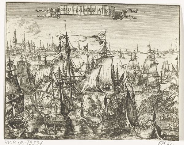
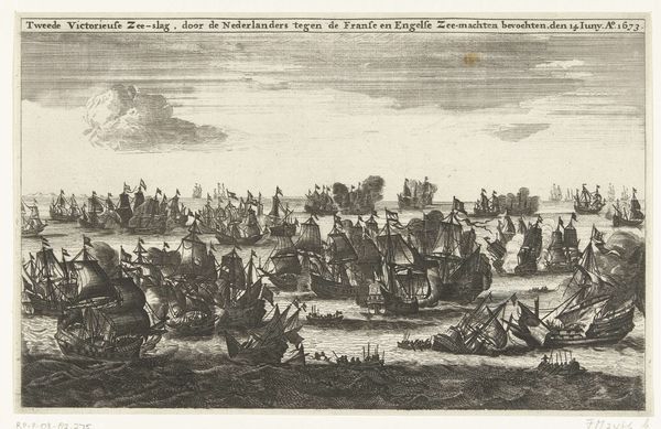
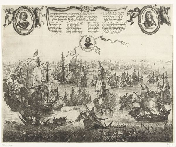
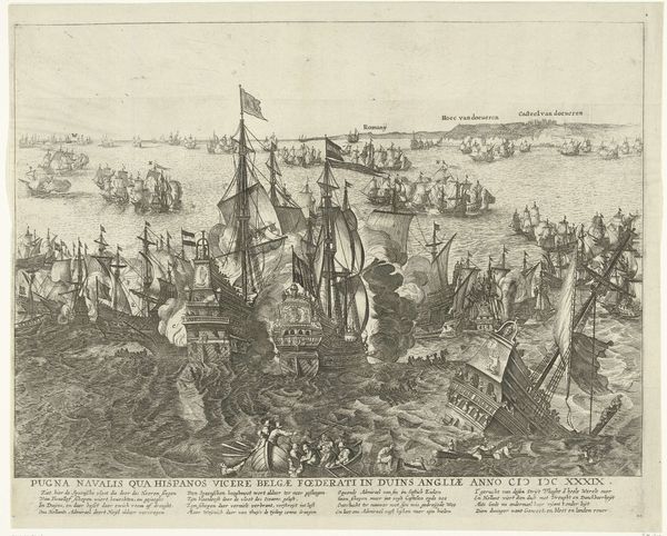
Editor: This is "Naval Battle at the Port of Focchies in 1649," an engraving made by Pieter Nolpe between 1649 and 1651. It looks incredibly chaotic, all these ships crammed into the harbor. What compositional elements stand out to you? Curator: The density of forms indeed commands immediate attention. Observe how Nolpe has structured the pictorial space through a meticulous orchestration of line and form. Note the deployment of ships as visual masses, strategically positioned to create both depth and dynamism. The lines work to produce not only the ships but the feeling of movement. What principles might we apply? Editor: Hmm, maybe principles of contrast? The dark ships against the lighter sky and water create a visual hierarchy, drawing my eye to certain areas first. Also, there's the contrast between the intricate detail of the ships in the foreground and the simplified forms in the background, suggesting depth and distance. Curator: Precisely. Semiotically, the image signifies power dynamics. It showcases the Dutch naval force but it also has a sophisticated arrangement of visual elements that communicate a historical event with force and clarity. How do the portraits fit in with your assessment? Editor: I initially saw them as a more generic type of heraldry, but I can see they add balance in the upper left and right corners, but the more I think about the relationship between the commanders and the rest of the image, the more disconnected it feels! Curator: Interesting! This could be a reference to the commanders’ emotional remove. I suggest considering the interplay between visual elements, in what way they contribute to our formal analysis, and also their tension. Editor: It gives me so much to consider and has sharpened my focus on compositional techniques, so thank you for your perspective!
Comments
No comments
Be the first to comment and join the conversation on the ultimate creative platform.
More like this