#
aged paper
#
toned paper
#
ink paper printed
#
hand drawn type
#
hand lettering
#
personal sketchbook
#
hand-drawn typeface
#
fading type
#
sketchbook art
#
watercolor
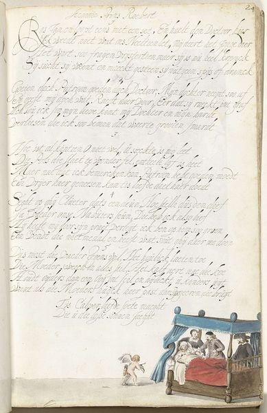
Dimensions: height 313 mm, width 204 mm
Copyright: Rijks Museum: Open Domain
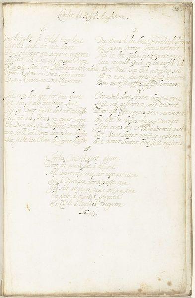
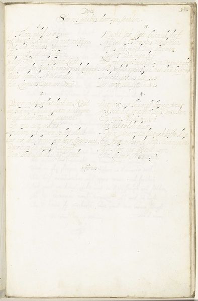
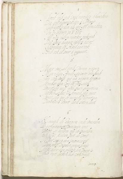
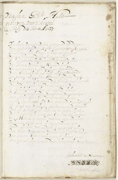
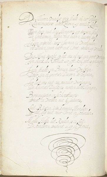
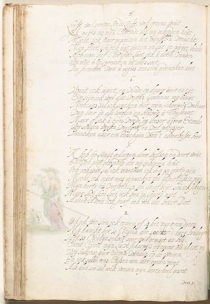
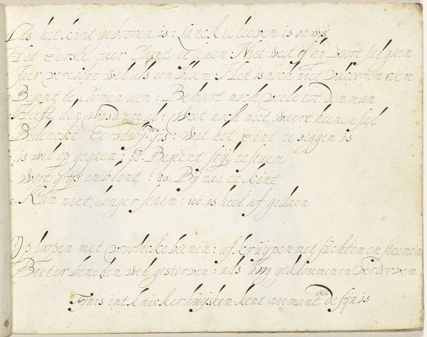
Editor: So, this is "Drinklied" from 1658, created by Gerard ter Borch. It seems to be a page from a personal sketchbook, done in ink and maybe watercolor on toned paper. The script is quite faded, like looking into the past itself. What can you tell me about the means of its production? Curator: Here, we see the artist not just composing an image, but carefully constructing script as a visual element. The hand-drawn typeface suggests a deliberate act of shaping language. It speaks volumes about literacy and social class during the Dutch Golden Age, and how knowledge production was linked to artisanal labor. Was creating the lettering similar to craftsmanship? Editor: I hadn't considered that angle. Is the choice of using handmade paper, rather than a print, itself significant? Curator: Absolutely. Handmade paper signals a commitment to process, to craft. This shifts the focus from simply transmitting information to celebrating the act of making. Do you see parallels between this deliberate construction and the rising merchant class, that also valued handcrafted, high-quality goods? Editor: That's fascinating! So it’s not just a drinking song, but an example of cultural and material values in practice. Was ter Borch highlighting wealth? Curator: In a way, yes. He makes very visible the means of textual and visual production; through careful examination of the material, "Drinklied" serves as both document and embodiment of the burgeoning Dutch economy in relation to skill. Editor: That's really changed how I see this. I was so focused on the script itself. Curator: By tracing how it's constructed from start to finish, this becomes less about *what* it says and more about *how* it came to be. Material reveals power.
Comments
No comments
Be the first to comment and join the conversation on the ultimate creative platform.
More like this