Copyright: Public domain
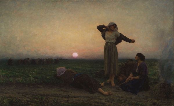
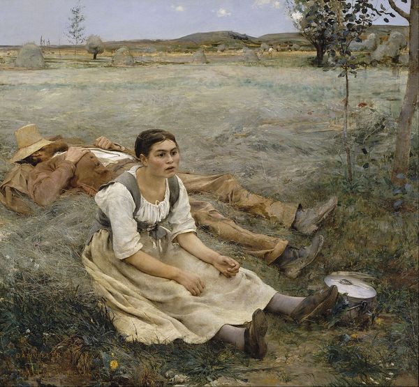
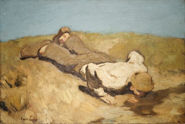
Editor: Hans Andersen Brendekilde's "Worn Out," painted in 1889. It's striking, mostly brown and beige tones but what caught my attention is the harsh flatness of the landscape. What can you tell me about the way the picture plane is constructed? Curator: The overwhelming horizontality certainly commands attention, doesn’t it? Observe how Brendekilde utilizes the limited palette to amplify the emotional tenor. Notice how the chromatic scale shifts gradually from foreground to background, generating a shallow depth of field. Editor: Right, the flattening does create this sort of tension. The lack of a vibrant color palette feels like it adds to the barren atmosphere. It feels like this affects our ability to find a visual respite. Was this a common effect in paintings of the period? Curator: In many ways. The artist skillfully manipulates the viewer's spatial perception, causing a distinct sense of unease. But consider too, the placement of the figures, slightly off center to the right of the painting. How might the composition play into a certain reading? Editor: Well, putting them off to the right could emphasize the desolation around them by creating more empty space to the left, perhaps hinting at the vastness of their despair or struggle. It creates a subtle imbalance and evokes an intense response, leaving me with this feeling of unsettled sorrow. Curator: Precisely! Brendekilde invites contemplation of existential themes. The work provides a formal tension that speaks to the human condition itself, no? It’s through understanding its structure that one can access the complex, affective power of the scene depicted. Editor: I see, understanding the structure is like unlocking the intended emotion. Thank you, that's insightful!
Comments
No comments
Be the first to comment and join the conversation on the ultimate creative platform.
More like this