drawing, paper, ink, pen
#
drawing
#
aged paper
#
hand-lettering
#
ink paper printed
#
old engraving style
#
hand drawn type
#
hand lettering
#
paper
#
ink
#
hand-drawn typeface
#
intimism
#
thick font
#
pen work
#
pen
#
sketchbook art
#
calligraphy
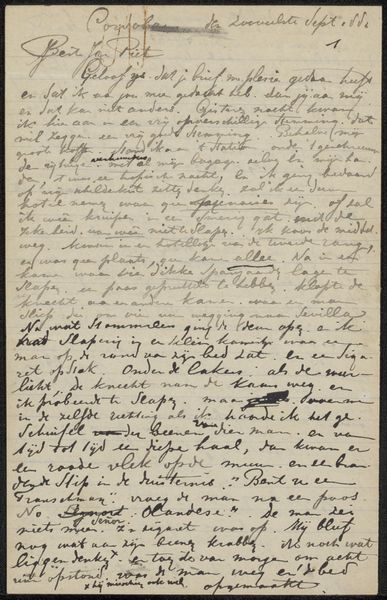
Copyright: Rijks Museum: Open Domain
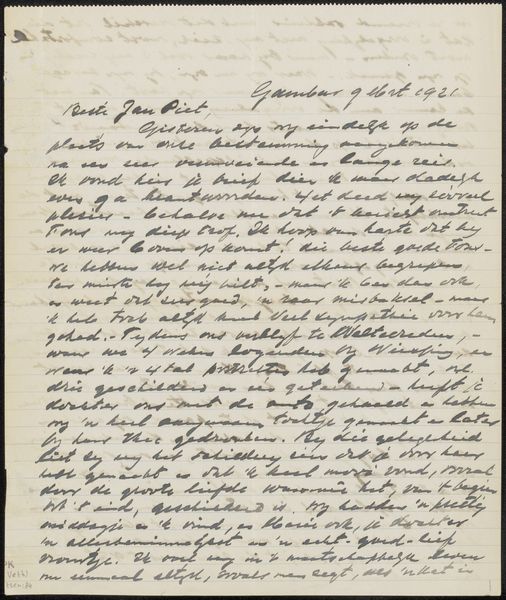
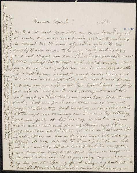
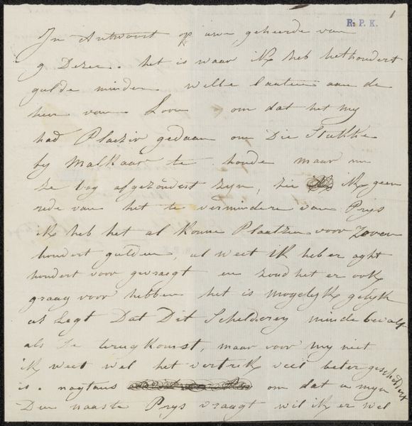
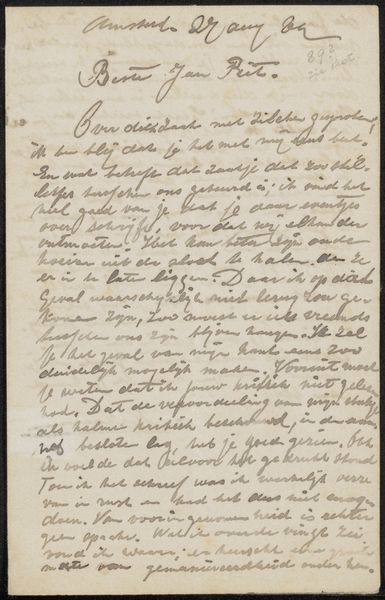
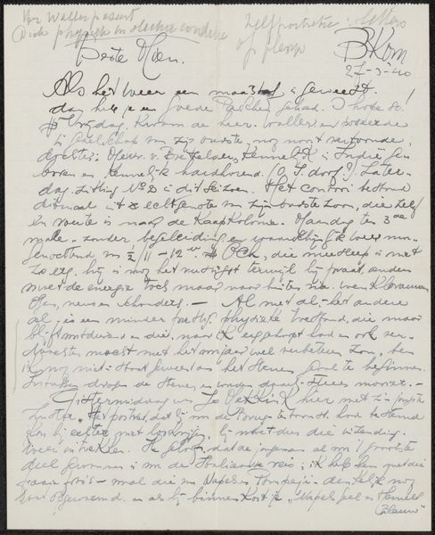
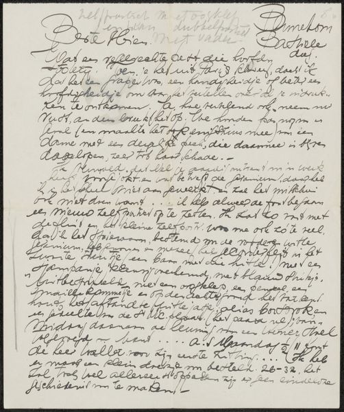
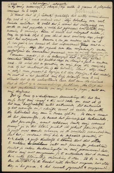
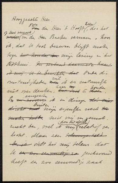
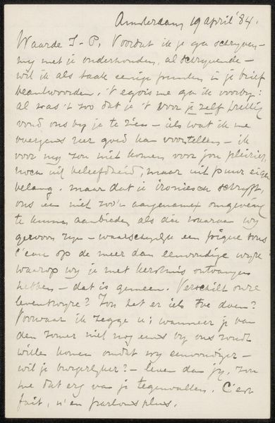
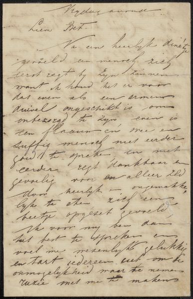
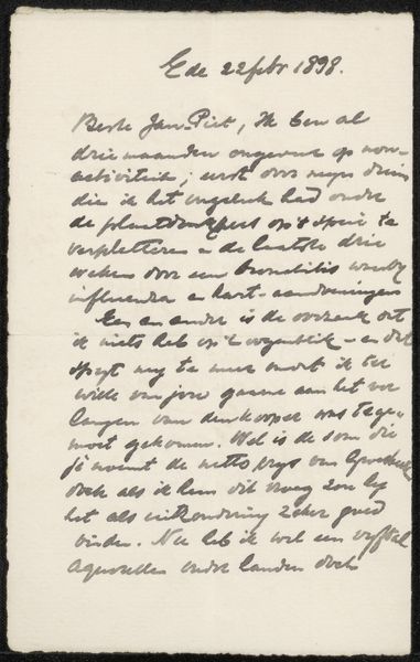
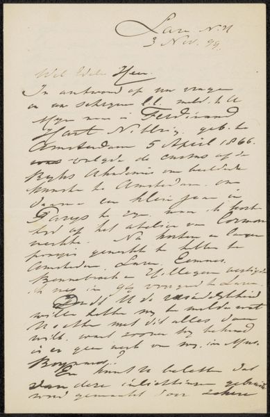
This is a letter made by Willem Witsen in 1921 with ink on paper. The overall tonality is one of monochrome, or near enough, which can feel quite flattening, but the texture is very rich. You can see the stroke of the nib creating subtle variations in thickness, as well as some ink blots and smudges. All of this adds up to a sense of intimacy, like we're really getting close to the hand that wrote these words. The pressure and rhythm almost feels like a musical score. Look at the flourish on the 'O' in Oviterpark, or the way that words occasionally over-write the lines above. I think this sense of layering is quite beautiful. It creates depth, like an etching, and also reminds us that writing, like art, is a process of thinking through making. It reminds me a little of Cy Twombly, a later artist who also explored the poetics of mark making.
Comments
No comments
Be the first to comment and join the conversation on the ultimate creative platform.
More like this