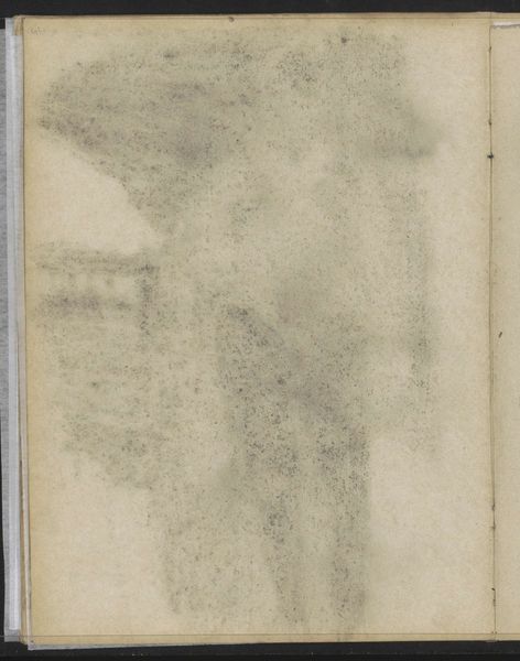
drawing, paper, graphite
#
portrait
#
drawing
#
paper
#
coloured pencil
#
graphite
Copyright: Rijks Museum: Open Domain
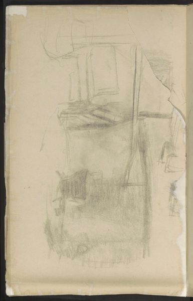
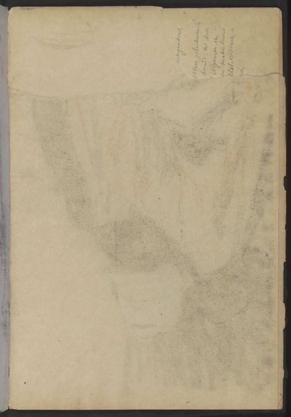
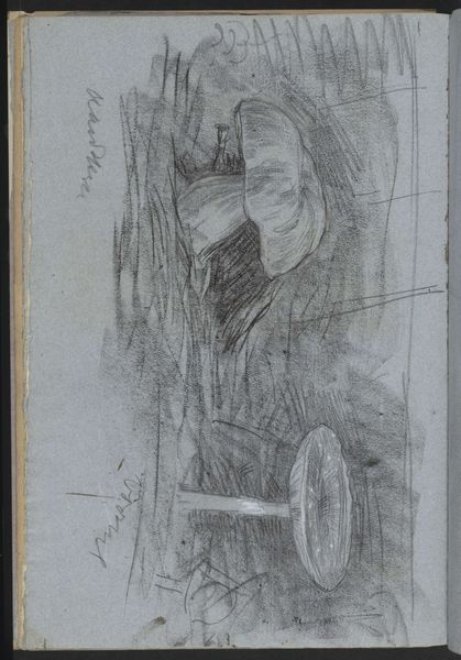
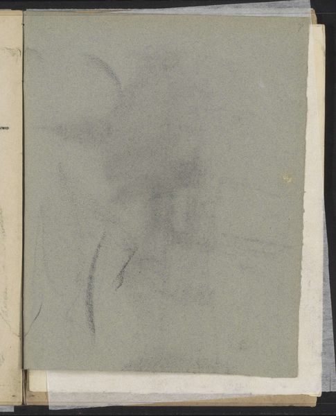
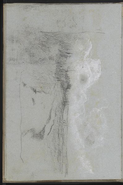
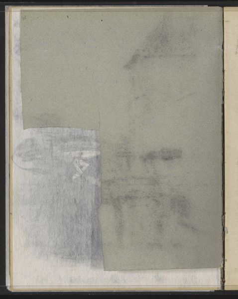
Curator: Here at the Rijksmuseum, we have "Abklatsch van de krijttekening op pagina 16 recto" a compelling piece by Jan Veth, dating somewhere between 1874 and 1925. It's primarily executed with graphite and coloured pencil on paper, presenting us with a somewhat ghostly portrait. Editor: Ghostly is right. It feels like a fading memory, or a face glimpsed in a dream. The subtle use of graphite and color really softens the edges. There’s something really delicate about it. It gives a soft intimate mood. Curator: The "Abklatsch" technique itself, essentially a transfer or rubbing, adds to that sense of transience. It immediately complicates traditional portraiture; who is seen and what makes seeing possible or impossible? It’s also worth noting Veth’s background as both artist and critic, often writing on social realism—suggesting his art subtly explored power dynamics. Editor: Right, there’s a tension between clarity and obfuscation at play here, isn’t there? Like he's hinting at a figure emerging from, or perhaps dissolving into, the background. This piece to me looks like what is felt just before speaking about vulnerability. It’s all there, swirling, unsure, hopeful, hidden. Curator: That sense of ambiguity is central. Given the era, we can speculate on the subject’s social positioning—gender, class—and how Veth might have been subtly commenting on societal roles through the very act of obscuring and revealing. Perhaps it’s even a deliberate attempt to deconstruct the traditional power dynamics inherent in portraiture, who is made visible and why? Editor: I like that. Deconstructing, not destroying. You can almost feel the ghost of intention. Almost like there's so much thought it doesn't matter that you can't 'clearly' see what's on the page. I bet the feel of the page in your fingers is almost everything. Curator: Exactly, and the work becomes more poignant if seen as challenging conventions of the era around representing an individual's likeness. Considering too, how paper frays with time. Editor: Mmm, that feeling that you can't see something that exists just beside the boundaries of vision. A great portrait doesn't have to be crisp, sharp, detailed or photo realistic. This artwork really whispers this truth to my core. It gets in! Curator: So beautifully put. It is a gentle challenge, maybe an act of artistic resistance against the established norms.
Comments
No comments
Be the first to comment and join the conversation on the ultimate creative platform.
More like this