drawing, print, watercolor
#
drawing
#
baroque
# print
#
landscape
#
watercolor
#
watercolour illustration
#
decorative-art
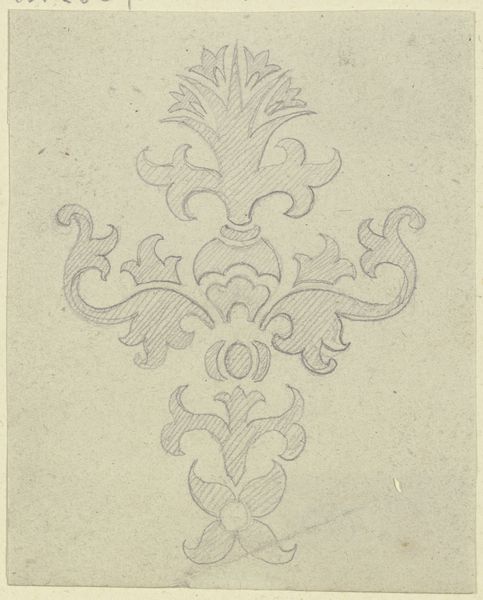
Dimensions: 7 3/8 x 6 3/16 in. (18.7 x 15.7 cm)
Copyright: Public Domain
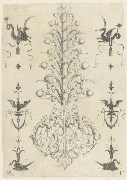
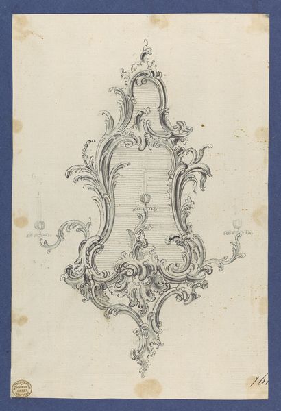
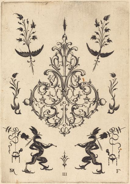
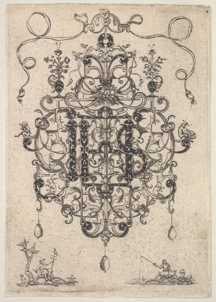
Curator: Welcome. We are looking at "Design for Upright Decorative Panels," a watercolor and ink drawing made sometime between 1700 and 1800 by an anonymous artist. It’s currently part of the Metropolitan Museum of Art’s collection. What are your immediate impressions? Editor: My first thought? Elegant melancholy. That pale blue… it’s a quiet kind of beauty, but there's something almost spectral about it. Curator: Indeed. The color palette certainly evokes a sense of tranquility. Consider the broader context: such designs were crucial in shaping the interiors of Baroque and Rococo era homes. It suggests a striving for harmonious spaces designed to promote certain ideals, sometimes promoting social status or wealth. Editor: Harmony, yes, but also a deliberate theatricality, a stage set for privileged life. The swirling foliage, the idealized doves… it’s almost too perfect, too staged. A lovely fiction. Almost saccharine. Curator: True. And consider the duality of this image, though created as a preparatory design, it lives as an artifact itself today, hanging framed on a wall instead of as an ornamental design painted onto a building’s walls, where it was designed to function. Its reception changes across centuries. Editor: So, it's a ghost of an intention, beautifully rendered! These doves nuzzling under ribbons of swirling fronds… I wonder, does the rigidity of design always negate the emotive power of imagery? Is that Baroque impulse for perfect order slightly at odds with art itself? Curator: That's the eternal question, isn’t it? This design, as an expression of Baroque aesthetic, shows how authority could be visualized and architectural trends shaped societies and individual expectations. Editor: Yet those stylized leaves, even after centuries, hold a spark of yearning. It’s a strange testament. A little bit tragic. Curator: A final observation: we are given a glimpse of period sensibilities, frozen, through watercolor on paper, yet still carrying enough feeling to resonate in the present. Editor: Perfectly stated! Proof that the designed life and lived life always seem to speak to one another across time. I think it leaves me seeing Baroque style just a tiny bit differently now. Thanks!
Comments
No comments
Be the first to comment and join the conversation on the ultimate creative platform.
More like this