print, engraving
#
portrait
#
baroque
# print
#
old engraving style
#
history-painting
#
engraving
#
columned text
Dimensions: height 212 mm, width 130 mm
Copyright: Rijks Museum: Open Domain
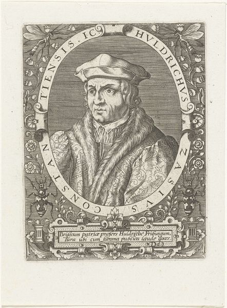
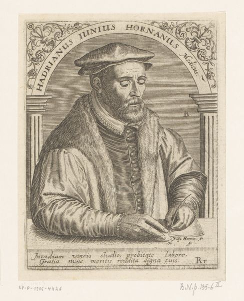
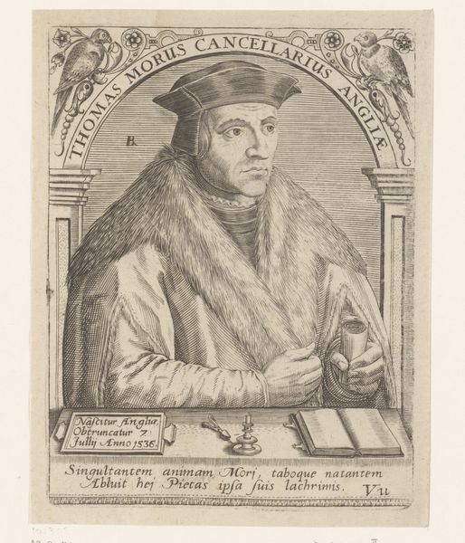
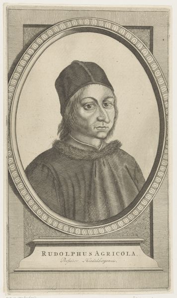
Editor: This is "Portrait of Regnerus Praedinius," a 1654 print by Steven van Lamsweerde. It's an engraving and has a very formal, almost severe tone. The detail achieved through engraving is impressive. What do you see in this piece, considered solely on its artistic merit? Curator: Indeed, observe first the strategic arrangement of line. Lamsweerde’s masterful control dictates tonal variation; the closely hatched lines coalesce into shadow, giving weight to Praedinius’ features, and the stark white of the page amplifies the textured fur collar. This dichotomy is not merely representational, it is integral to the print’s structure. Do you agree? Editor: I do. The sharp contrast definitely draws my eye. But beyond that, the oval frame and surrounding text also create an interesting composition. Do those elements contribute significantly to the artwork’s impact, structurally speaking? Curator: The circular form encasing the subject concentrates the gaze, eliminating superfluous detail. Notice how the inscription, almost acting as a visual frame, reinforces the subject’s identity, providing, as it were, a textual armature to the visual form. The typography too invites a kind of structural comparison: letterforms mirroring, to some extent, the rigorous, unwavering lines employed in the portrait itself. Editor: So the print is successful because of the controlled interplay of its various elements. The use of light and shadow, the framing, and even the lettering work together to form a unified whole. I never thought about analyzing a portrait in this way before. Curator: Precisely. By deconstructing the artwork to its essential formal components, we appreciate how line, shape, and texture combine to generate aesthetic and intellectual meaning. Consider it an exercise in discerning artistic syntax.
Comments
No comments
Be the first to comment and join the conversation on the ultimate creative platform.
More like this