About this artwork
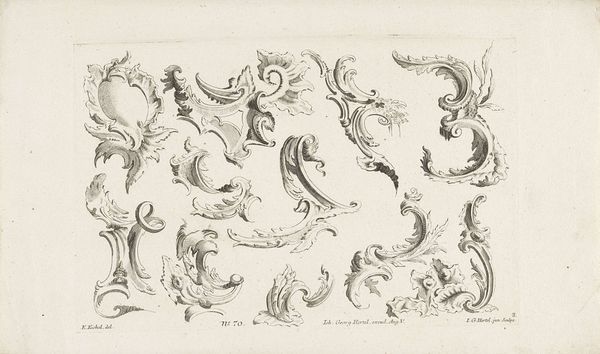
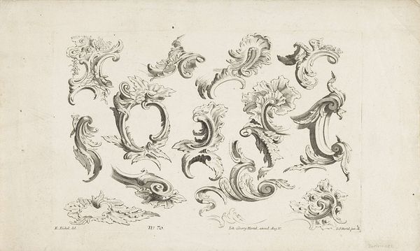
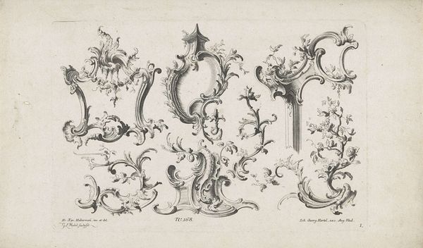
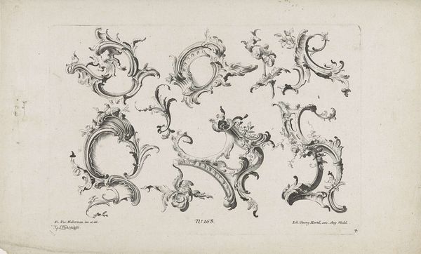
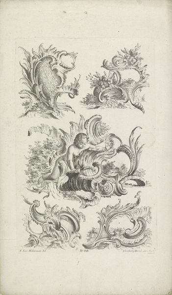
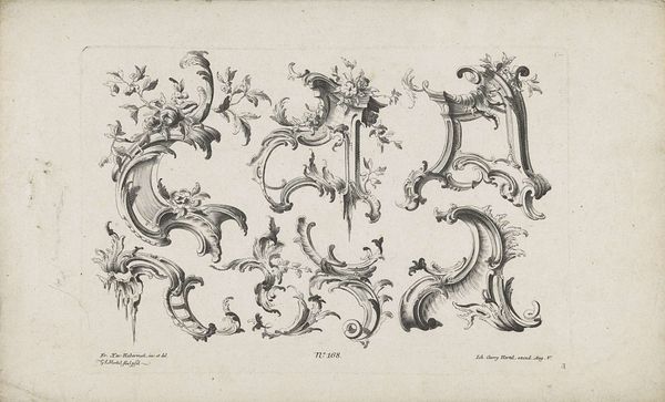
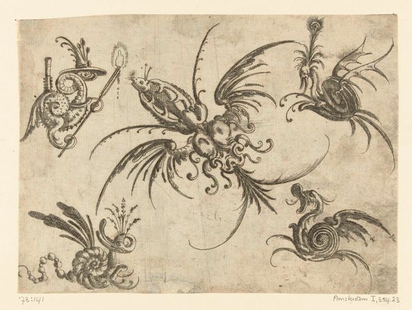
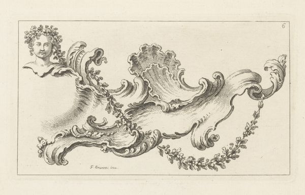
Curator: Look at this pen and ink drawing—it's called "Voluut- en bladvormige rocaille-ornamenten" by Johann Georg Hertel. It’s part of the Rijksmuseum collection and dates back to between 1727 and 1775. Editor: My first impression? Playful. Almost like visual frosting. The delicate linework, the swirling forms… it’s as if Hertel was sketching daydreams. Curator: Spot on. Rococo art aimed for that lightness. This drawing offers a whole catalogue of design elements. Imagine these flourishes decorating a stately home. But I see it more broadly, don't you? A time of shifting power where even the lines on the walls protested the established order. The strict geometry of previous eras was rejected for this fluid grace. Editor: I'm intrigued by what you say about power, the role these shapes may play in legitimizing ruling classes who used decoration as symbolic armor. The rocaille elements act almost as a coded language. The motifs might speak of conquest or tradition but veiled beneath these whimsical flourishes. What stories could they silently tell? Curator: Fascinating perspective! For me, though, it comes back to pure expression. These aren't just patterns; it's like Hertel has captured the essence of growth, movement frozen on paper. The asymmetry keeps your eye dancing across the composition. It’s dynamic! Editor: True, the tension between dynamism and control is palpable. There’s something inherently political in choosing such organic, seemingly 'unruly' forms within the framework of rigid architectural projects. To question traditional structures, and perhaps celebrate diversity. Curator: Whether rebellious or simply beautiful, I can't help but find so much joy in its details. This close attention to craftsmanship really connects me with another era. Editor: For me it speaks to something bigger than period aesthetic. I think it also offers a potent metaphor. A gentle invitation, if you will, to peel back layers. It encourages us to confront how artistry disguises messages and manipulates perspective, but perhaps with intent to free something old.
Voluut- en bladvormige rocaille-ornamenten
1727 - 1775
Johann Georg Hertel
1695 - 1775Location
RijksmuseumArtwork details
- Medium
- drawing, ornament, paper, ink
- Dimensions
- height 193 mm, width 297 mm
- Location
- Rijksmuseum
- Copyright
- Rijks Museum: Open Domain
Tags
drawing
ornament
pen sketch
paper
form
ink
line
decorative-art
rococo
Comments
Be the first to share your thoughts about this work.
About this artwork
Curator: Look at this pen and ink drawing—it's called "Voluut- en bladvormige rocaille-ornamenten" by Johann Georg Hertel. It’s part of the Rijksmuseum collection and dates back to between 1727 and 1775. Editor: My first impression? Playful. Almost like visual frosting. The delicate linework, the swirling forms… it’s as if Hertel was sketching daydreams. Curator: Spot on. Rococo art aimed for that lightness. This drawing offers a whole catalogue of design elements. Imagine these flourishes decorating a stately home. But I see it more broadly, don't you? A time of shifting power where even the lines on the walls protested the established order. The strict geometry of previous eras was rejected for this fluid grace. Editor: I'm intrigued by what you say about power, the role these shapes may play in legitimizing ruling classes who used decoration as symbolic armor. The rocaille elements act almost as a coded language. The motifs might speak of conquest or tradition but veiled beneath these whimsical flourishes. What stories could they silently tell? Curator: Fascinating perspective! For me, though, it comes back to pure expression. These aren't just patterns; it's like Hertel has captured the essence of growth, movement frozen on paper. The asymmetry keeps your eye dancing across the composition. It’s dynamic! Editor: True, the tension between dynamism and control is palpable. There’s something inherently political in choosing such organic, seemingly 'unruly' forms within the framework of rigid architectural projects. To question traditional structures, and perhaps celebrate diversity. Curator: Whether rebellious or simply beautiful, I can't help but find so much joy in its details. This close attention to craftsmanship really connects me with another era. Editor: For me it speaks to something bigger than period aesthetic. I think it also offers a potent metaphor. A gentle invitation, if you will, to peel back layers. It encourages us to confront how artistry disguises messages and manipulates perspective, but perhaps with intent to free something old.
Comments
Be the first to share your thoughts about this work.