sculpture
#
natural shape and form
#
abandoned
#
grass
#
sculpture
#
land-art
#
nature
#
abstract
#
derelict
#
rock
#
geometric
#
sculpture
#
nature friendly
#
naturalistic tone
#
nature heavy
#
nature closeup
#
neglected
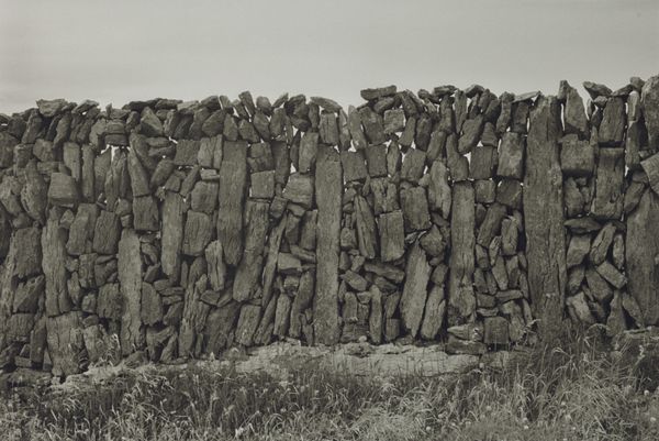
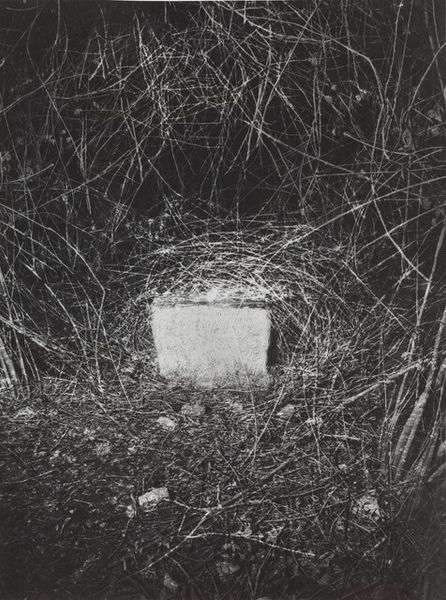
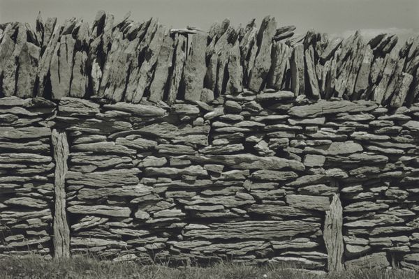
Copyright: Karl Prantl,Fair Use
Editor: This is Karl Prantl's "Epitaph der Vergänglichkeit," created in 1985. It looks like it is made of carved stone. Its placement in the field makes the stone’s form stand out dramatically against the natural landscape. What catches your eye about it? Curator: Immediately apparent is the contrasting treatment of the stone’s surfaces. Notice the sharp horizontal lines bisecting the left face of the sculpture; consider how these intentional articulations engage with the more roughly hewn surfaces which comprise the bulk of the volume. Do you perceive a tension between the geometrical and the organic? Editor: Yes, definitely. It’s like two different artistic approaches are fighting for dominance, and that interplay is very arresting. The contrast in textures creates so much visual interest. Curator: Precisely. Consider how this tension invites contemplation. The regularity of the lines speaks to imposed order, perhaps a system or structure. And what about the unfinished planes of granite? Could this juxtaposition, placed within a pastoral context, encourage a meditation on artifice versus nature, permanence against transience? Editor: That makes a lot of sense, given the title and the natural elements surrounding the artwork. I appreciate how breaking down the formal aspects opens up richer avenues for interpretation. Curator: By attending closely to its material qualities and their arrangement, we uncover its capacity to resonate conceptually and aesthetically. The interplay of line, form and texture presents us a compelling visual dialogue. Editor: I never considered analyzing sculpture this way! Thanks to this perspective, I think I'll see Land Art through fresh eyes going forward.
Comments
No comments
Be the first to comment and join the conversation on the ultimate creative platform.
More like this