Dimensions: height 432 mm, width 338 mm
Copyright: Rijks Museum: Open Domain
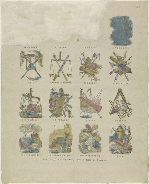
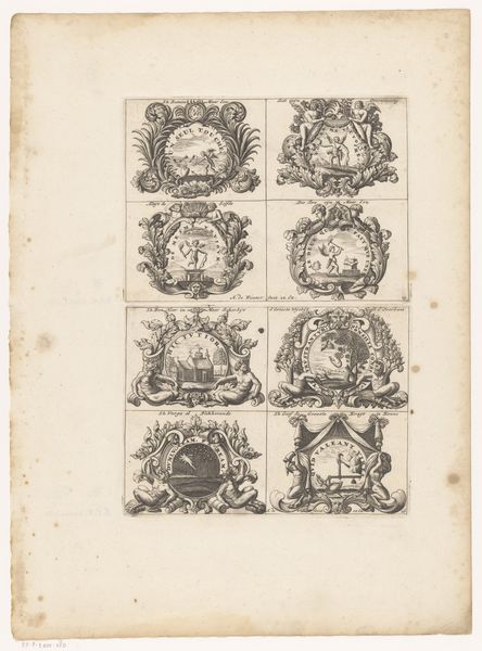
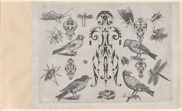
Curator: Welcome. Here we have "Verschillende Zaken," or "Different Matters," a print dating from 1822 to 1849, created by Jan de Lange II. It’s a fascinating piece. Editor: Yes, immediately striking. The composition feels… well, compartmentalized yet oddly unified. A grid of small, symbolic vignettes. What's most immediately noticeable is its use of rudimentary color to distinguish details among engravings on what looks to be a weathered piece of paper. Curator: Weathered indeed. The printing press that Jan de Lange operated from his house indicates how these prints may have been more commercial productions accessible to ordinary folk. The imagery, even in its crude style, is all tied to philosophical themes, or perhaps trades. Each vignette becomes like a small advertisement. Editor: Intriguing! The semiotic density here is pretty wild. We have an orb labeled “Ierteleat,” and nearby is an hourglass, scythe, and angel wings. A memento mori, clearly dealing with earthly matters. I want to examine the implements: how the etcher made marks, scratched and layered the paper with meaning. Curator: And consider the paper itself—what kind of rag was used, its weave and source. You have symbols for war, scales of justice. Was he commissioned by different craft guilds perhaps? I wonder about the socio-economic context for these symbols. Editor: True, what was the culture that understood these quick visual cues, each symbol holding its space economically. Curator: Look how rudimentary they are: even to our modern eye we recognize these images – beehive representing labor or church standing for the divine; consider that those original viewers were even closer to this type of visual thinking, one based in agriculture and trades that rely on imagery. Editor: Each of these images would carry so much associative freight for the artisans who might be consuming them. Take ‘Kunst’, with its easel and painter's tools, and how its creation relied so greatly on the physical implements. Curator: Precisely. Even the rough quality points us back to the labor of the artist and the materials at hand. The print provides visual representations of professions that likely made use of his printing business. Editor: So, from the ink’s grain to its symbolism, the material and its form are completely fused. This makes one see these small symbols as a product and art work all in one!
Comments
No comments
Be the first to comment and join the conversation on the ultimate creative platform.
More like this