About this artwork
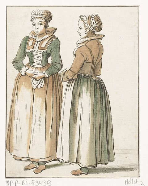
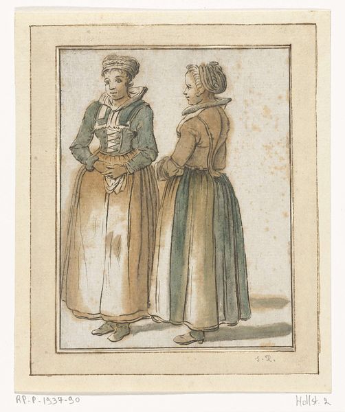
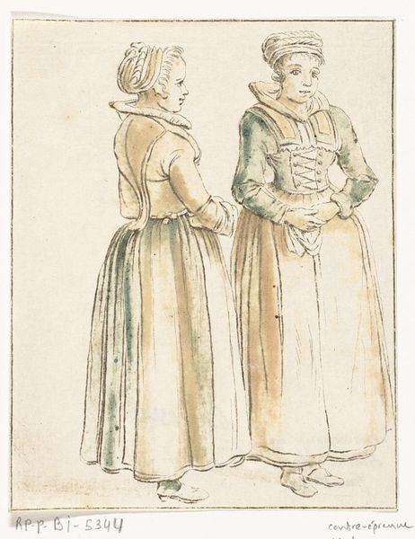
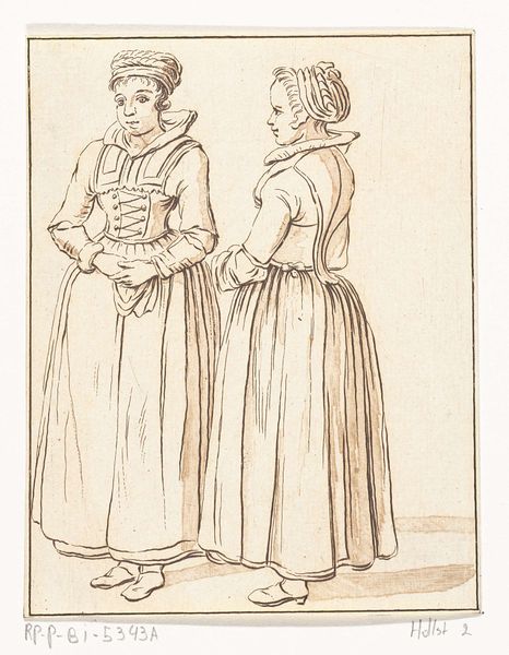
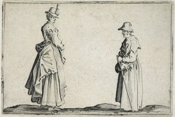
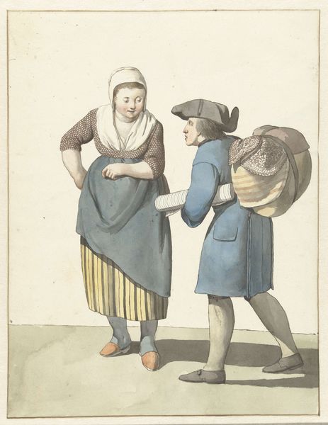
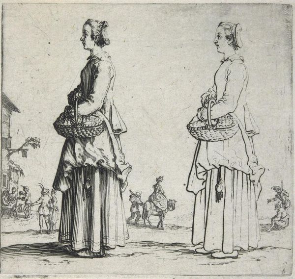
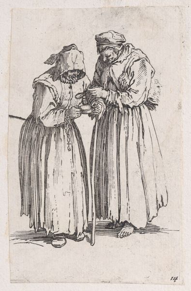
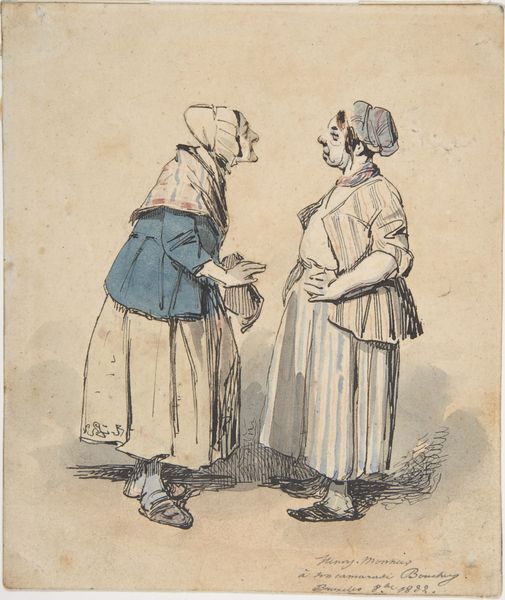
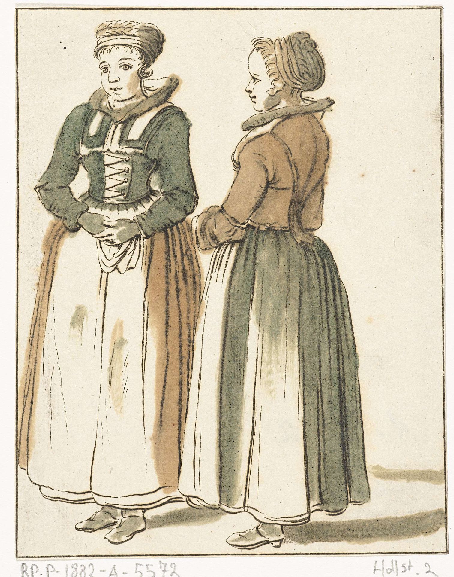
Curator: Hendrik Busserus, the creator of this work from sometime between 1711 and 1781, has masterfully rendered what appears to be a genre scene using pen and paper—it's a drawing called “Twee staande vrouwen,” currently residing here at the Rijksmuseum. Editor: They have a haunting, ethereal quality. The lines are confident, yet there's a sketch-like feel, a certain fragility underscored by the muted washes of color. Is there something Northern Renaissance about their bearing? Curator: Interesting observation. While stylistically it’s filed as Dutch Golden Age, you can see vestiges of the Northern Renaissance with their modest clothing and reserved poses. This would speak to prevailing notions of femininity at that time. Note their headdresses—a visual indicator of status and perhaps region. Such details are social signifiers that reveal much about identity and community. Editor: Indeed. The clothing creates this incredible play of horizontals versus verticals—the severe lines of their skirts contrasting with the intricate details of their bodices. The visual weight anchors them, rooting them in both social expectation and tangible reality, doesn’t it? But it does bring up questions about their class, or perhaps their purpose? Curator: Quite right. Genre paintings, particularly portraits like these, provide a window into the everyday lives of people from different classes and occupations during that period. These aren’t portraits of nobility; instead, the picture plane shows everyday life in the Netherlands. These two women, presented plainly, offer us insight into what domestic life may have been at the time. Editor: And to consider that the work exists in pen on paper intensifies the reading: a readily accessible method; everyday, humble. Is it too much to see a relationship between material, image, and context, where all components share the burden of expressing accessibility? Curator: A point well taken. This drawing allows us a closer look—unfiltered, so to speak—into a time removed from our own. Its unpretentious materiality amplifies the impact of the representation, creating a subtle but compelling impression. Editor: Precisely. Its compelling structural rhythm of lines, the color values… the experience of art lies within that interplay between line and meaning, you see, which keeps it relevant through the ages. Curator: I appreciate that—by using visual codes, the artwork keeps carrying collective memories from generations past. Thank you for that reading.
Artwork details
- Medium
- drawing, paper, pen
- Dimensions
- height 121 mm, width 95 mm
- Location
- Rijksmuseum
- Copyright
- Rijks Museum: Open Domain
Tags
Comments
Share your thoughts
About this artwork
Curator: Hendrik Busserus, the creator of this work from sometime between 1711 and 1781, has masterfully rendered what appears to be a genre scene using pen and paper—it's a drawing called “Twee staande vrouwen,” currently residing here at the Rijksmuseum. Editor: They have a haunting, ethereal quality. The lines are confident, yet there's a sketch-like feel, a certain fragility underscored by the muted washes of color. Is there something Northern Renaissance about their bearing? Curator: Interesting observation. While stylistically it’s filed as Dutch Golden Age, you can see vestiges of the Northern Renaissance with their modest clothing and reserved poses. This would speak to prevailing notions of femininity at that time. Note their headdresses—a visual indicator of status and perhaps region. Such details are social signifiers that reveal much about identity and community. Editor: Indeed. The clothing creates this incredible play of horizontals versus verticals—the severe lines of their skirts contrasting with the intricate details of their bodices. The visual weight anchors them, rooting them in both social expectation and tangible reality, doesn’t it? But it does bring up questions about their class, or perhaps their purpose? Curator: Quite right. Genre paintings, particularly portraits like these, provide a window into the everyday lives of people from different classes and occupations during that period. These aren’t portraits of nobility; instead, the picture plane shows everyday life in the Netherlands. These two women, presented plainly, offer us insight into what domestic life may have been at the time. Editor: And to consider that the work exists in pen on paper intensifies the reading: a readily accessible method; everyday, humble. Is it too much to see a relationship between material, image, and context, where all components share the burden of expressing accessibility? Curator: A point well taken. This drawing allows us a closer look—unfiltered, so to speak—into a time removed from our own. Its unpretentious materiality amplifies the impact of the representation, creating a subtle but compelling impression. Editor: Precisely. Its compelling structural rhythm of lines, the color values… the experience of art lies within that interplay between line and meaning, you see, which keeps it relevant through the ages. Curator: I appreciate that—by using visual codes, the artwork keeps carrying collective memories from generations past. Thank you for that reading.
Comments
Share your thoughts
