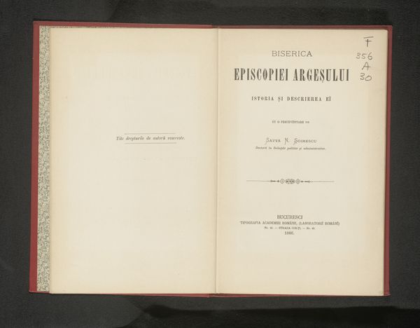
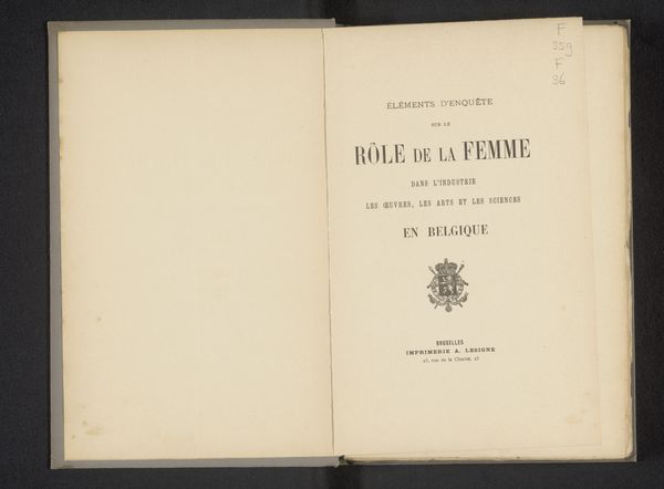
La Hongrie agricole et ses haras : compte-rendu d'une excursion agricole à Mezohegyes c. 1876
print, typography
aged paper
homemade paper
script typography
paperlike
french
personal journal design
personal sketchbook
typography
fading type
thick font
paper medium
historical font
Dimensions: height 219 mm, width 151 mm, thickness 4 mm
Copyright: Rijks Museum: Open Domain
Curator: The starkness of this print immediately strikes me. The typefaces and the space around them create such an open, almost austere feel. Editor: You’re right, it is quite minimalist. This is a title page, created circa 1876 by Adolphe Mertens. The text, in French, translates to “Agricultural Hungary and its Stud Farms: Report of an Agricultural Excursion to Mezőhegyes.” Curator: It is so interesting that this publication discusses agriculture in Hungary! The late 19th century saw so many shifts in agrarian economies and related labor practices across Europe. How might this excursion, and subsequently this publication, have influenced those agricultural reforms? Editor: Possibly substantially, especially considering its origin in Brussels and the dissemination channels available then. But looking at the printing itself, notice how the weight and style of the font varies, directing your eye. The title commands attention, followed by the more descriptive, smaller text. Curator: A beautiful use of hierarchy to emphasize its political message of national importance. It is fascinating how this object, likely intended for a very specific audience—agricultural reformers and perhaps the aristocracy—speaks to us now about transnational knowledge exchange and the socio-political value placed on certain kinds of labor. The typography serves as a declaration. Editor: Exactly. And I would add that the paper itself appears aged, lending another layer of historical texture that deepens our connection to the era. Curator: Absolutely. Reflecting on this, I realize how important it is to consider the convergence of text, context, and the materiality of knowledge dissemination in understanding social movements and changes of the time. Editor: And for me, this simple typographic print serves as a compelling lesson in the effectiveness of clean, thoughtful design.
Comments
No comments
Be the first to comment and join the conversation on the ultimate creative platform.