watercolor
#
abstract painting
#
abstract
#
watercolor
#
geometric-abstraction
#
modernism
#
watercolor
Copyright: Modern Artists: Artvee
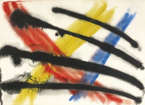
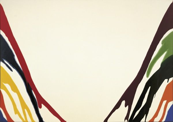
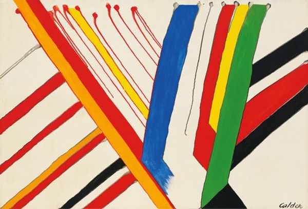
Alexander Calder made this watercolor called 'Levels' sometime in the 1960s, and it’s all about process. Look at the way he’s let the colors bleed and drip; it’s like he’s inviting chance into the studio. The primary colors—red, yellow, and blue—sit so nicely against the creamy paper. He applies them in such a way that feels intuitive, you know? The ink lines are a riot—some bold, some delicate, with blobs like dark little cherries at the top. You can see the ink bleeding into the paper, creating these soft edges. It's like a dance between control and letting go. What does it mean to have the hand, the paint, but also gravity, at play? You could compare this to a Miro, especially in how he orchestrates these playful shapes. They both allow for some degree of randomness, and invite it. It reminds us that art doesn’t always need to be so serious, or pre-planned. Sometimes, you just gotta let the paint do its thing, and see where it takes you.
Comments
No comments
Be the first to comment and join the conversation on the ultimate creative platform.
More like this