Copyright: Public Domain: Artvee
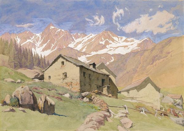
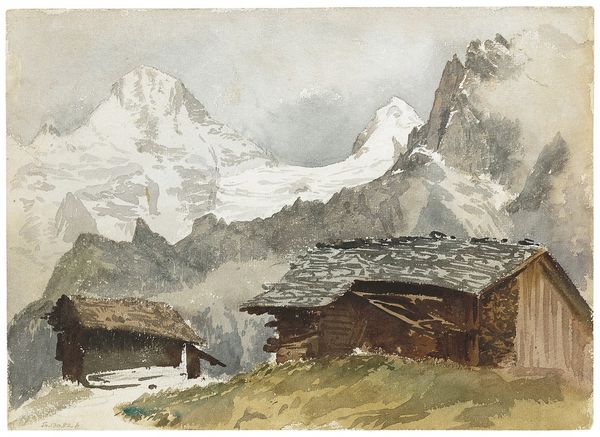
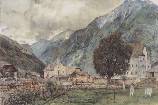
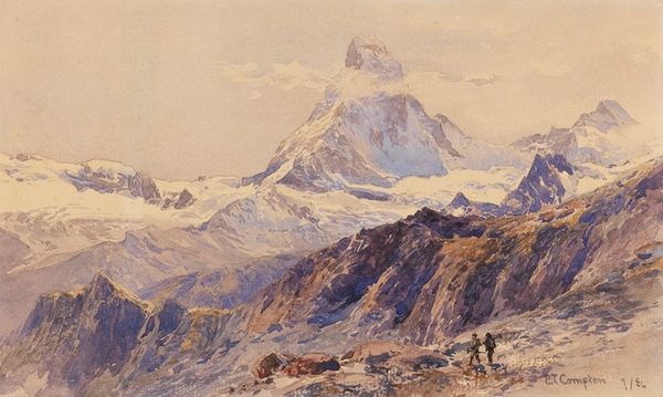
Editor: Here we have Edward Theodore Compton's "Die Alpe Barneuza," painted in 1900. It seems to be primarily watercolor and evokes a sense of serene majesty with its towering mountains and humble buildings. What do you see in this piece, focusing on the elements that make it work formally? Curator: Immediately, I'm drawn to the interplay between the defined forms of the foreground and the ethereal, almost dissolving, background. The structures are rendered with a sharp realism, drawing the viewer in. Then, Compton employs a distinct shift in technique, using diluted washes to represent the receding planes of the mountains. Editor: So it's the contrast in brushstrokes and application that captures your attention? Curator: Precisely. Notice how the roofs of the buildings present angular lines against the softness of the verdant meadow and the glacial forms. The eye is directed upward through this carefully orchestrated juxtaposition of texture and tone. The composition draws us toward an apex – the mountain's peak, if you will. It becomes an ascending structural cadence. Editor: That's an interesting perspective. I was initially just seeing a pretty picture of a landscape. Curator: Is it the scale or perceived sense of beauty distracting you? Can you define which colours attract your attention first and why? It’s in understanding this you come to interpret an artwork beyond what is depicted in plane sight. Editor: Good point. It looks like the painting's organisation of visual elements is not just decorative; it shapes the way we experience and think about the image, beyond a landscape. Curator: Exactly. It is through close consideration of colour, form and texture, and their arrangement that we unlock meaning and impact of such works.
Comments
No comments
Be the first to comment and join the conversation on the ultimate creative platform.
More like this