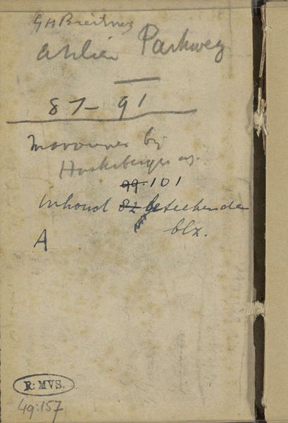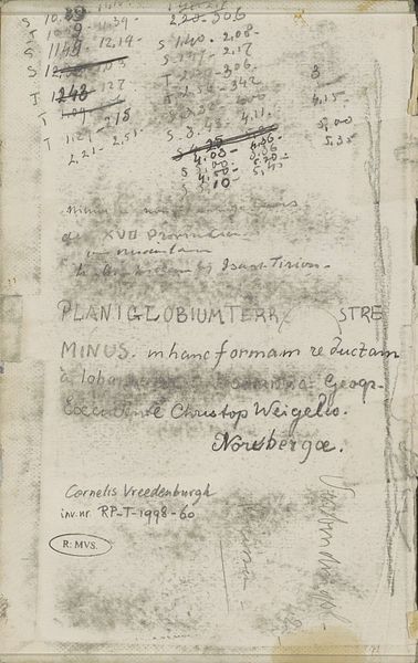
Curatorial notes
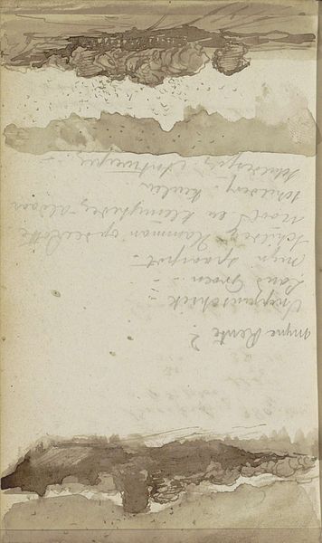
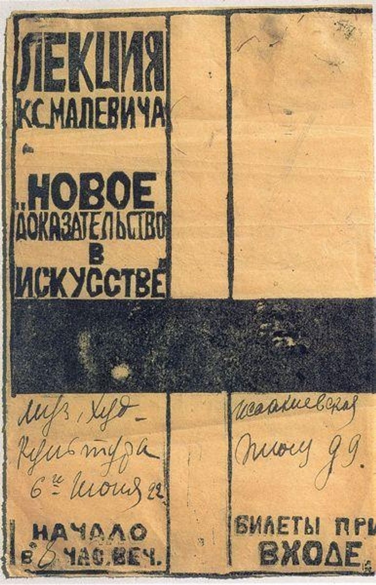
This billboard, made by Kazimir Malevich, perhaps with ink and paper, presents a very reductive color scheme. It's a tight grid, with the contrast of a dark ink against the light paper, defining its structure. Look at the broad horizontal stroke in the center—it's almost like a solid plane, but you can see the uneven application, like it’s been stamped on. The blocky, solid forms hint at Suprematism, and Malevich's pursuit of pure artistic expression. The contrast between the solid forms and the handwritten text adds a layer of playfulness, like the art world’s shout out to its audience: a lecture on art theory, reduced to its essential form. This piece reminds me of the work of Kurt Schwitters, with his embrace of the ephemeral. Both artists invite us to reconsider what constitutes art, seeing poetry in the everyday detritus of the modern world. Malevich invites us to engage with the dynamic and fluid nature of art itself, where meaning is not fixed, but constantly evolving through our interaction with the work.