#
op art
#
colour-field-painting
#
geometric
#
abstraction
#
line
#
hard-edge-painting
#
orange
Copyright: (c) Ellsworth Kelly, all rights reserved
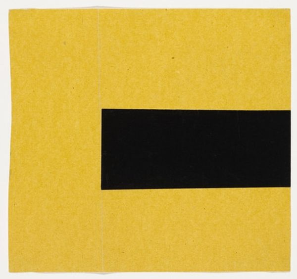
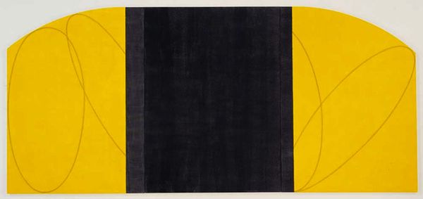
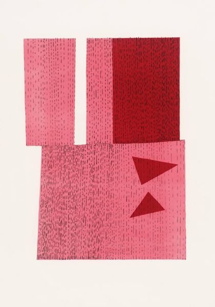
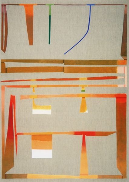
Curator: Here we have Ellsworth Kelly’s "Pink and Orange from the series Line Form Color," created in 1951. Editor: The juxtaposition of these rectangular color blocks—mainly horizontal but of different lengths and widths—is very satisfying. I particularly like the off-center vertical band, providing both contrast and balance. Curator: Kelly, known for his hard-edge painting, here relies on pure form and color to achieve this visual effect, working primarily in two colors. What do you notice about how these shapes and shades were composed, using the simple materials of paper and paint? Editor: The color palette seems deliberately flat, challenging the notion of depth. Also, it appears Kelly constructed this out of paper scraps, right? The imperfections are clear, there are visible seams, that the shapes have not been perfectly cut or laid. Curator: Yes, collage was part of the practice; considering the means of production and how those materials are joined is a must when talking about Kelly. He actively embraced imperfections. One wonders if this might be traced to Kelly's experience during WWII; in the army he learned camouflage design principles, with its emphasis on shape recognition, perception and, I imagine, also using material that was available and economical to manufacture? Editor: That context certainly adds another dimension! For me, the impact hinges on the negative space between the shapes—those gaps are as crucial as the solid forms. It creates a rhythm, almost like a visual score. Curator: Agreed. It provokes thinking around process versus finished work: for instance, that slightly off vertical column is less than precise—I’d even suggest that the overall “messiness” of this is the key to understanding what it means. I understand it as deconstructing of aesthetic values. Editor: Maybe. Although, to be honest, the raw and pure effect created by the geometric elements feels deceptively simple—it’s easy to overlook the care that’s gone into balancing line, form and color. The harmony here is remarkable. Curator: True. The conversation it sparks between precision and accident is quite remarkable. It compels me to ponder the meaning in simplicity and the beauty in unrefined processes. Editor: Exactly! I am struck with its meditative essence as the interlocking horizontal lines fade into a depthless background. This piece will definitely leave you captivated by its abstract language.
Comments
No comments
Be the first to comment and join the conversation on the ultimate creative platform.
More like this