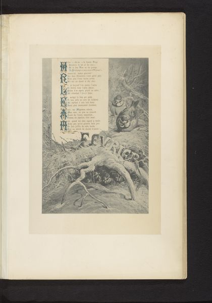
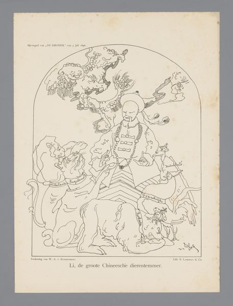
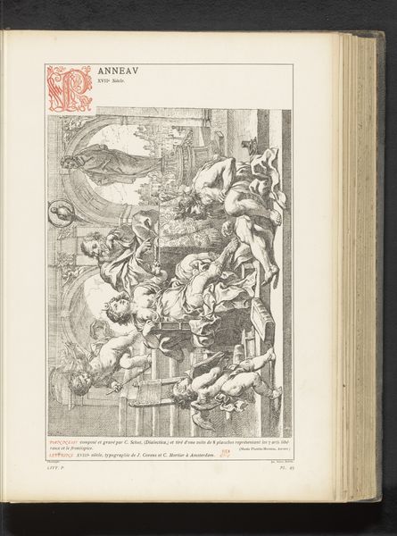
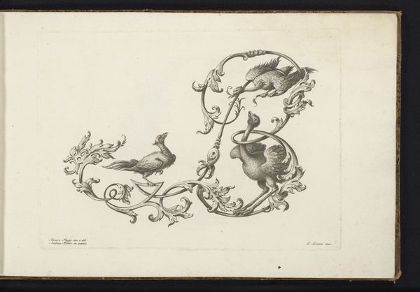
Reproductie van een prent van een letter R en een letter L ontworpen door Theodoor de Bry, gedecoreerd met figuren, vogels en fruit before 1880
0:00
0:00
drawing, print, ink, engraving
#
drawing
# print
#
old engraving style
#
bird
#
figuration
#
11_renaissance
#
ink
#
fruit
#
line
#
symbolism
#
decorative-art
#
engraving
Dimensions: height 232 mm, width 344 mm
Copyright: Rijks Museum: Open Domain
Curator: This drawing presents a reproduction of a print featuring the letters R and L. It's attributed to Theodoor de Bry and thought to be made sometime before 1880. The image itself is rendered in ink, employing engraving techniques, and showcasing detailed figuration. Editor: It’s quite busy, isn't it? Almost overwhelmingly so. My initial reaction is a sense of decorative excess; it feels like every available space is filled with some form of ornamentation. The composition verges on chaotic, despite the underlying structure of the letters. Curator: Indeed. This piece falls firmly into decorative art. Note how the linear quality is paramount. It echoes the Renaissance tradition, intertwining symbolism within its very structure. De Bry clearly plays with visual complexity, using lines to create depth and movement. Semiotically, the density hints at both richness and perhaps a desire for encyclopedic knowledge that was characteristic of that period. Editor: I think it tells us a lot about the societal role of art, particularly printed art, in spreading knowledge and taste during its time. Images such as these helped define visual culture, shaping how people perceived the world around them. The letters themselves would have served a didactic function; the decorative elements are not merely aesthetic choices. They reflect and reinforced certain ideologies or status symbols of the period. Curator: Precisely. Looking closer, notice the fusion of organic forms such as birds and fruit interwoven with these constructed letters. It is this combination of nature and artifice. We see clear parallels with the decorative programs of Renaissance and Early Modern palaces. Consider it also from a structuralist viewpoint: it almost inverses norms because the literal 'foundation' is not what we immediately recognise, the forms create those foundations for recognition instead. Editor: It’s fascinating how such seemingly innocuous decorative elements can act as a window onto past cultural values. One imagines that the artist would intend these symbols to also carry some element of elite class appeal, in tandem with Renaissance scientific interests and humanistic symbolism that reflects their time of social transition. This piece really shows how design is not just about visual appeal, it is a social process! Curator: It indeed asks that of us. These converging styles, the interplay between order and chaos, are a reminder that forms can shape not just visual perception but the way society encodes values. Editor: Well said. Ultimately, considering the socio-political background, makes engaging with the work feel more insightful and dynamic than initially assumed from first impression.
Comments
No comments
Be the first to comment and join the conversation on the ultimate creative platform.
More like this