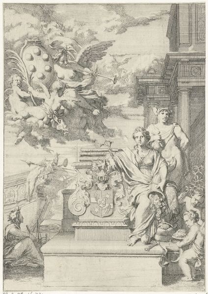
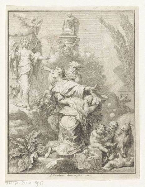
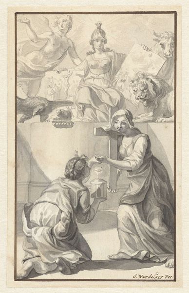
Ontwerp voor het titelblad van W. van der Hoeven, Westermeer, 1721 1721
0:00
0:00
janwandelaar
Rijksmuseum
drawing, paper, ink, pencil
#
drawing
#
allegory
#
baroque
#
pencil sketch
#
landscape
#
figuration
#
paper
#
ink
#
pencil drawing
#
pencil
#
history-painting
Dimensions: height 200 mm, width 156 mm
Copyright: Rijks Museum: Open Domain
This title page design for W. van der Hoeven’s "Westermeer" was rendered in pen, brush and gray ink by Jan Wandelaar in 1721. The drawing’s dynamism derives from Wandelaar’s skilled use of line and wash. The pen work defines the forms, creating a sense of precision, while the gray ink wash adds depth, volume and tonal variation. Look closely at the allegorical figures: each is carefully modeled with subtle gradations of tone, enhancing their lifelike quality. The graphic arts in the 18th century were highly collaborative; design, draughtsmanship, and the skilled labor of engraving were distinct activities. Each required specific expertise, and each added value to the finished product, which in this case was a printed book. By considering the labor involved, and the division of labor at the time, we can appreciate this drawing not just as a design, but as a point of intersection between artistic vision, technical skill, and early capitalist modes of production.
Comments
No comments
Be the first to comment and join the conversation on the ultimate creative platform.
More like this