drawing, paper, ink
#
portrait
#
drawing
#
hand-lettering
#
hand drawn type
#
hand lettering
#
paper
#
personal sketchbook
#
ink
#
hand-drawn typeface
#
ink drawing experimentation
#
fading type
#
ink colored
#
sketchbook drawing
#
sketchbook art
#
calligraphy
Copyright: Rijks Museum: Open Domain
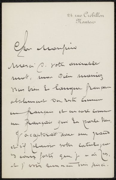
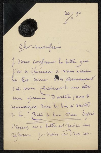
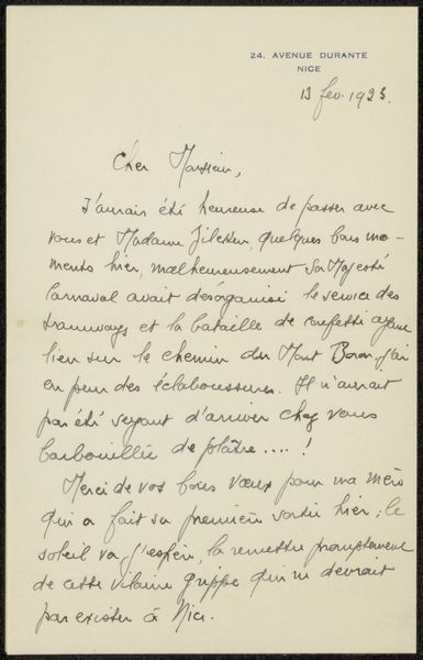
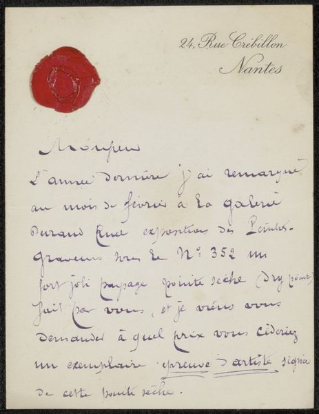
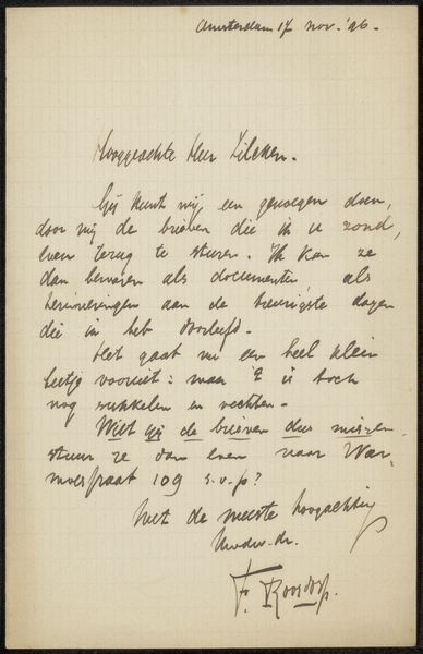
Curator: Here we have "Brief aan Philip Zilcken," possibly from 1895, by Gustave Bourcard. It's rendered in ink on paper. The script itself dominates the composition. Editor: Yes, an intimate visual field. The handwritten aspect brings immediacy, like a portal to another person’s thoughts. And the purple ink conveys an atmosphere of faded elegance. Curator: Considering Bourcard’s known dedication to graphic arts, specifically his expertise as a printmaker, the form of this "letter" suggests something beyond personal correspondence. It reads to me as more of a reflection on the art of writing itself, especially the tools used to convey it. Editor: That's interesting. Look at how the script almost becomes abstract, the curves and loops creating their own rhythms, independently of their legibility. The letterform itself seems infused with symbolic meaning. Like a cipher...or perhaps even an echo of a forgotten language? Curator: Or simply exploring the qualities inherent in ink and paper. Notice the deliberate variations in the thickness of the lines. The artist experiments with pressure and flow, making the writing a tactile performance. He really brings out the materiality of his media here, almost flaunting the craft itself. Editor: True, but the choice to render the letters so delicately... I think it adds another layer. It is a memento. The fading suggests loss. It's poignant, hinting at fragile memory and ephemeral connection, and also serves as an important marker to track a friendship now long over. Curator: Perhaps we both read into it. To me, the beauty is the straightforward exploitation of simple tools to communicate, while the iconography, as you suggest, evokes something more elegiac, resonant across time. Editor: I appreciate the contrast, as I always enjoy a melancholic undertone, especially when rendered so exquisitely.
Comments
No comments
Be the first to comment and join the conversation on the ultimate creative platform.
More like this