drawing, watercolor, pencil
#
drawing
#
baroque
#
landscape
#
watercolor
#
coloured pencil
#
pencil
#
cityscape
Dimensions: height 388 mm, width 252 mm, height 534 mm, width 316 mm
Copyright: Rijks Museum: Open Domain
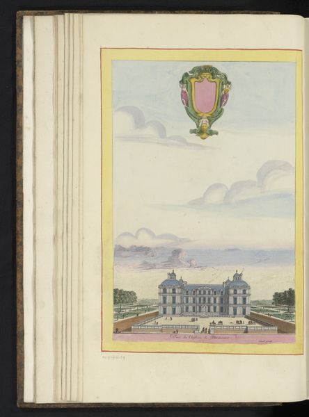
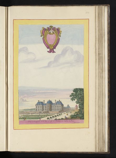
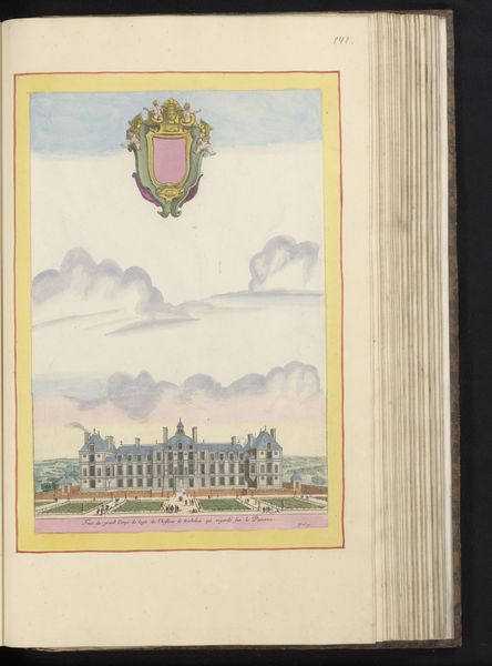
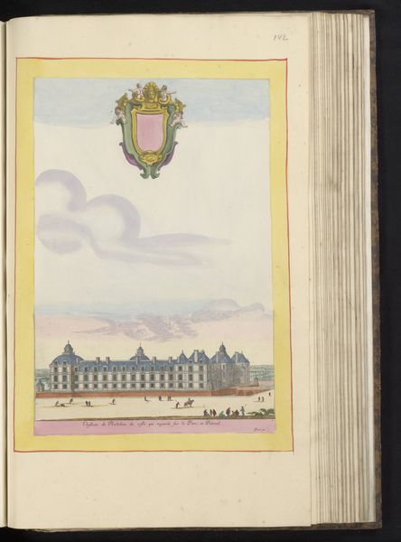
Curator: Standing before us, we have "View of the Hôtel de Soissons in Paris" created sometime between 1631 and 1661 by Israel Silvestre. The Rijksmuseum proudly holds this drawing which uses watercolor and pencil. What catches your eye first? Editor: Definitely that soft palette – pastels floating like memories. And then the meticulous detail. I see layers, not just in the color washes, but in the societal layers represented, right? The labor involved to build that palace, maintain those gardens… all visualized in strokes. Curator: Absolutely, you're hinting at the material conditions right away. The Hôtel de Soissons was quite a hub, especially due to Catherine de Medici’s patronage. But isn't it curious how Silvestre floats that almost cartoonish coat-of-arms above? A bit cheeky, like poking fun at the very grandeur he's depicting. Editor: Cheeky, yes, but also strategic. These visual representations of power–they aren’t simply about artistry, but propaganda, and justifying social hierarchies through aesthetics. Who commissioned this piece? Who benefits from this idealised view of labour and status? I would be very interested in original documents around the commision. Curator: Sadly, direct commission details are a bit murky for this piece. But the purpose resonates with print culture trends during that time: spreading ideas, projecting power... What gets me is the artist's ability to give form to these sprawling gardens. There's a real lightness, despite all that stone. How does the process—drawing with pencil, and applying washes of watercolor— affect your impression of this depiction of place and leisure? Editor: I appreciate how he delineates the architecture but blurs boundaries through watery techniques. This interplay, though simple, destabilizes the apparent solidity of wealth by foregrounding the tools employed in representing wealth. To make a print, after all, involved laborers to manufacture the paper, pigments, etc. Curator: Indeed! It adds to the complexity. So much to contemplate within one carefully rendered sheet of paper. The layers—aesthetic, historical, and socio-economic—begin to intertwine rather seamlessly. Editor: Yes, from pigment to power. A picture's worth a thousand realities. Thank you for bringing us here, it opens a range of perspectives.
Comments
No comments
Be the first to comment and join the conversation on the ultimate creative platform.
More like this