painting, acrylic-paint
#
abstract-expressionism
#
painting
#
landscape
#
charcoal drawing
#
acrylic-paint
#
abstraction
#
modernism
#
watercolor
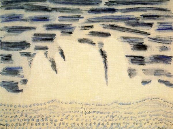
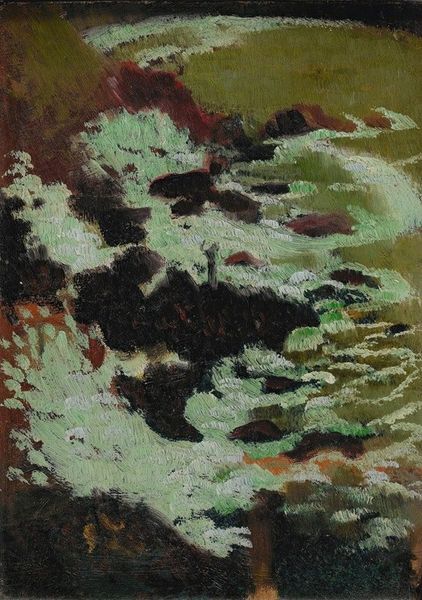
Copyright: Milton Avery,Fair Use
Milton Avery made this dreamy seascape, Advancing Sea, with oil on canvas. His colours are muted, mostly whites, greys, browns, and a dark blue-purple for the solid form in the middle. He’s got these colours interacting with each other, mixing them, layering them to create a sense of depth and atmosphere. It’s like Avery is thinking through the process of painting. The paint is applied thinly, almost translucent in some areas, allowing the canvas texture to peek through. In the lower portion of the work, see how he drags and swirls the brush to describe a wave. There’s a real sense of movement, but it’s all implied, not literal. Avery’s work reminds me a lot of Mark Rothko's colour field paintings. Both artists use simplified forms and colour to evoke emotion and a sense of contemplation. But where Rothko goes big and bold, Avery is much more restrained, subtle, and nuanced. Avery’s work is all about finding the extraordinary in the ordinary.
Comments
No comments
Be the first to comment and join the conversation on the ultimate creative platform.
More like this