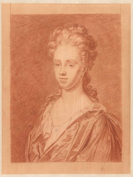
drawing, paper, pencil
#
portrait
#
drawing
#
baroque
#
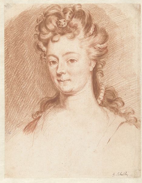
pencil sketch
#
paper
#
pencil drawing
#
pencil
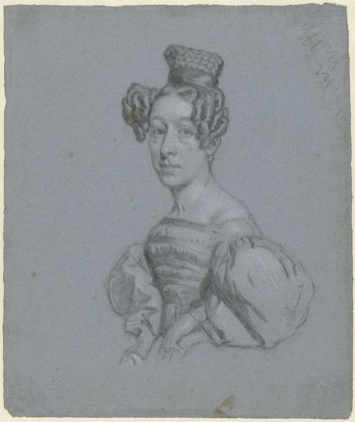
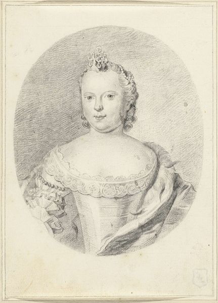
Dimensions: height 170 mm, width 112 mm
Copyright: Rijks Museum: Open Domain
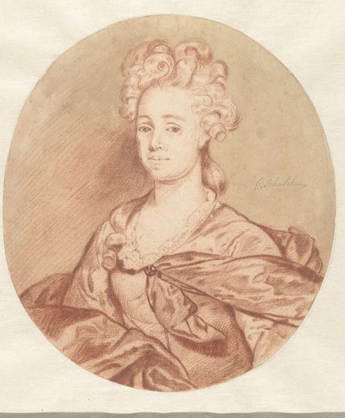
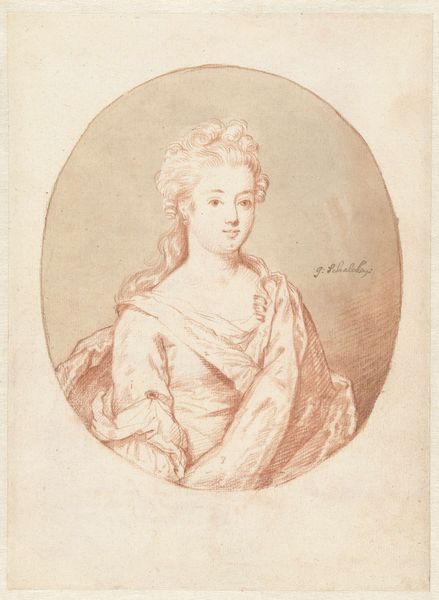
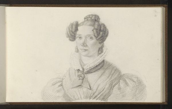
Curator: Looking at this pencil drawing by Aert Schouman from the 18th century, "Portret van Wilhelmina Frederica Sophia van Pruisen," I am struck by its quietness, almost a ghostly presence captured in these delicate lines. Editor: The ghostly quality is right – the grey paper substrate speaks loudly about the drawing's process, the scraping, the layering to reach that spectral tonality. I think of the powdered graphite traveling between the artist's fingers, leaving these barely-there traces… It’s interesting that graphite only started gaining in quality around 1750, while this drawing comes from around the same period, which might speak about the limited access to materials. Curator: Precisely. Observe the economical yet incredibly precise hatching, especially around the facial features. The rendering creates volume, communicating her regal bearing. Consider how the linear construction of her attire juxtaposes beautifully with the ethereal curls. Note, as well, how the strategic use of minimal color calls attention to her regal persona. Editor: Yes, and that "strategic use of minimal color," or rather, the subtle indication of a textile texture with red chalk around the collar… that signals opulence and labor investment even without intricate detail. You almost feel the cost in human hours within these small touches. It makes you reflect on how social and political standings affect access to both material and opportunity. Curator: Indeed, the textural implications support the context of its production, which reflects her position in society. And I also appreciate the very conscious balance between defined contour and softer modeling... There's something truly remarkable about Schouman's ability to elicit so much presence using seemingly so little. Editor: Exactly – the minimal execution amplifies my perception of labor division and privilege as its framework and key ingredient. Overall, thinking about how labor manifests in visual representation and also conditions our viewing of historical portraiture feels enriching.
Comments
No comments
Be the first to comment and join the conversation on the ultimate creative platform.
More like this