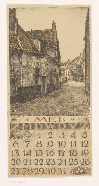
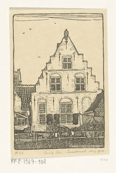
Dimensions: height 319 mm, width 155 mm
Copyright: Rijks Museum: Open Domain
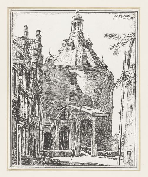
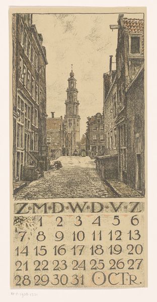
Curator: Alright, let's dive into this piece. What strikes you about it initially? Editor: Well, there's an undeniable quaintness to it, like peering into a meticulously rendered dollhouse. The lines are so precise, it almost feels brittle, you know? The November chill practically radiates from the aged paper, almost gives you the shivers, in a comforting sort of way. Curator: That's interesting. This is actually Ferdinand van Wolde's "Kalenderblad november met stadsgezicht in Haarlem" from 1923. It's an etching, so that explains the fineness of the lines you're picking up on. The piece wonderfully showcases a cityscape of Haarlem, the Netherlands as a decorative calendar page. Notice the details, like the brickwork or the towering church steeple. Editor: I do! The meticulousness is really something, the attention dedicated to the windows and rooftops. It is more than mere representation; the drawing style seems to invoke that old world-charm by use of a style with pen and ink which feels really intimate like a scene straight from an illustrated novel, you know. But that calendar portion is a bit strange... the font looks off and those leaf-like flourishes in the top... Curator: Well spotted! Van Wolde combined representational art with applied art. And yes, you're right, those flourishes lend an art nouveau touch amidst the burgeoning modernism that was emerging in the Netherlands at the time, quite the fascinating and perhaps purposeful disjunction! This element adds a touch of organic life amidst the urban setting. Editor: Yeah. And despite the obviously precise execution, there is some sort of whimsy peeking through as well... almost beckoning the viewer to explore the mysteries held within those narrow alleyways and shadowed corners. I want to just step into that street scene and see where it takes me... but only if it's not too cold out. Curator: The emotional texture really resonates, doesn't it? We can almost sense what Van Wolde was expressing through the contrast of lines and light. It captures both a time and a mood with such deliberate, yet sensitive execution. Editor: Absolutely. Looking closer, what’s quite compelling for me is how the artist balances the stark linearity of the cityscape with these softer textural elements – particularly those cloudy or shaded areas around the top, that give a slightly more surreal touch than just an engraving alone may give... Curator: Precisely! It's as if he is using this almost rigid structure to create a framework for emotional reflection. In that context it transcends the label "calendar." Editor: Yeah, well... I definitely wouldn't throw this away on December 1st, that's for sure! Thanks for the breakdown! Curator: My pleasure! Glad to share my perspective on such a lovely little work.
Comments
No comments
Be the first to comment and join the conversation on the ultimate creative platform.
More like this