graphic-art, print, photography
#
graphic-art
#
aged paper
#
still-life-photography
#
paperlike
# print
#
typeface
#
editorial typography
#
photography
#
printed format
#
journal
#
thick font
#
publication mockup
#
san serif
#
publication design
Dimensions: height 111 mm, width 144 mm
Copyright: Rijks Museum: Open Domain
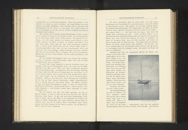
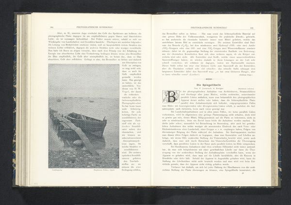
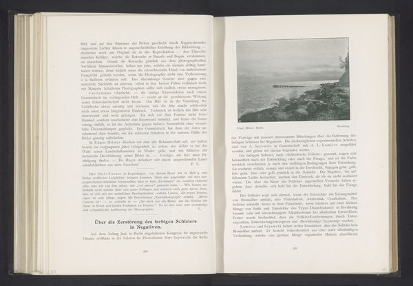
Curator: What a captivating image. This is "Schepen op open water" attributed to Bruno Schmidt, dating from before 1901. It appears to be a reproduction in a journal of some kind, rendered in graphic-art print. Editor: It feels incredibly melancholic. The tonal range is quite narrow, lending this dreamlike softness and stillness, almost like time has stopped, but its aged form communicates of a far away place and time. Curator: Given that this image is presented in what looks to be an aged publication format with aged paper and a thick typeface, there's definitely a sense of looking into the past, wouldn’t you agree? Also, water, as a symbol, often reflects the depths of the unconscious. What does the ship sailing in the open water signal to you? Editor: Absolutely. The text frames the image; like the architecture that frames our view and thus directs our perspective of looking. I am seeing repeated hard edges around organic shapes, between sharp edges and flowing waves, so this contrast makes for visual interest. Curator: The placement of the image within a published journal also resonates with a long tradition of photography being used to disseminate and fix the fleeting nature of moments in time for both individuals and larger cultural consumption. Consider how journals also served an important function in circulating ideas. How can you compare and contrast the ships to ideas circulating across bodies of water, be it literally or conceptually. Editor: Interesting observation. But back to composition for a moment - did you notice how this composition relies on relatively basic shapes to achieve overall complexity, that seems fundamental. Also the water seems very alive. Its lack of reflection gives a weightness to it, yet there's still an unmissable serenity and romance as if captured at dawn. Curator: Well said, its presentation invokes nostalgia by default. When I consider ships sailing over time immemorial across waterways and beyond, its romantic to a fault! The journey motif is culturally and psychologically loaded. Editor: Agreed. The limited gray scales add complexity of depth. As we bring it to a close I still see a very unique picture, but a very dark one, very aged as well. The use of typeface as it sits on the journal page makes this piece feel timeless as an object. Curator: Indeed, it captures that poignant intersection of tangible history and our intangible, personal reflections. We get to voyage to the unknown, once again.
Comments
No comments
Be the first to comment and join the conversation on the ultimate creative platform.
More like this