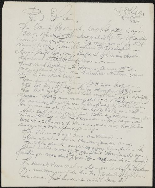
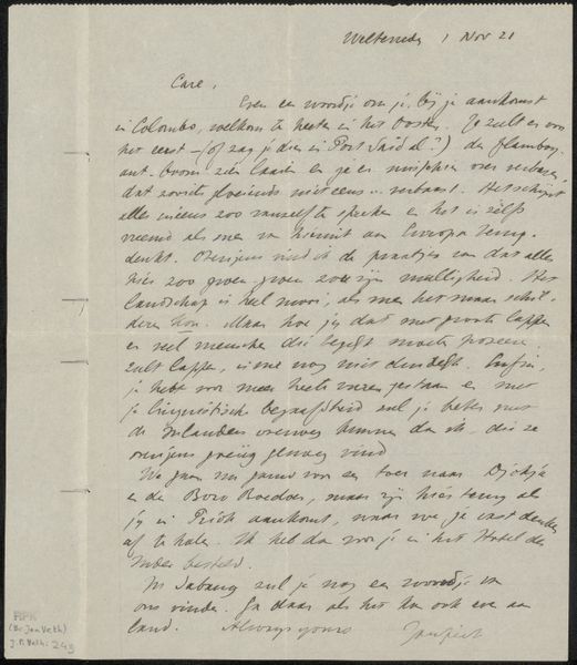
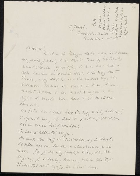
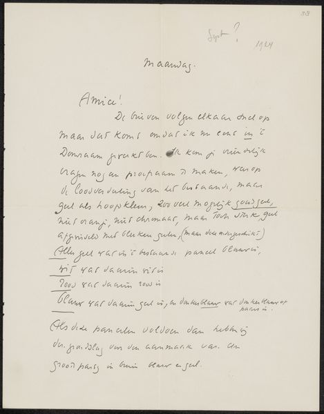
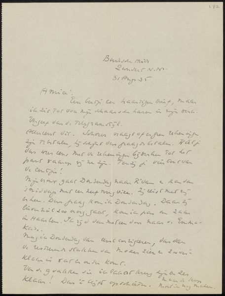
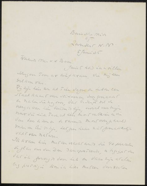
drawing, paper, ink
#
drawing
#
paper
#
ink
Copyright: Rijks Museum: Open Domain
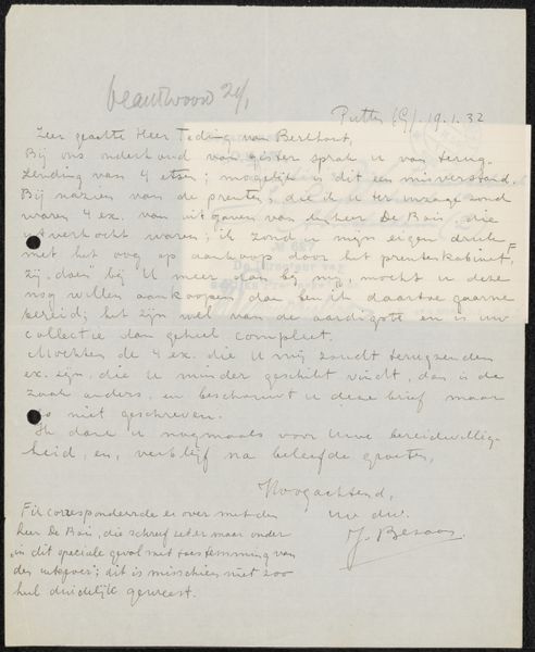
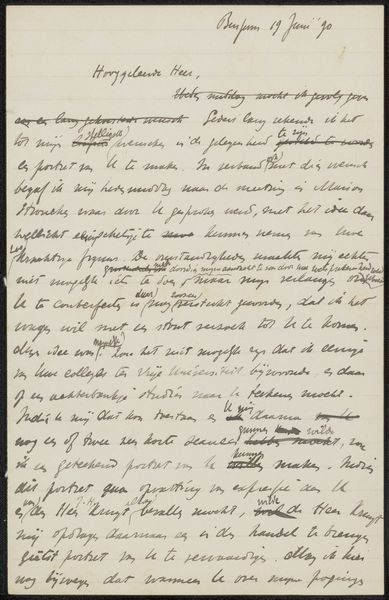
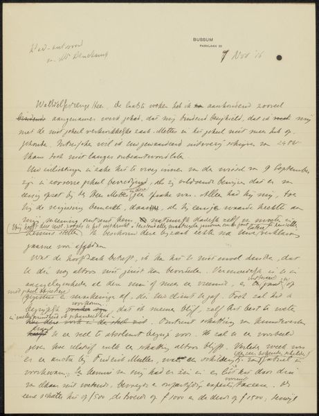
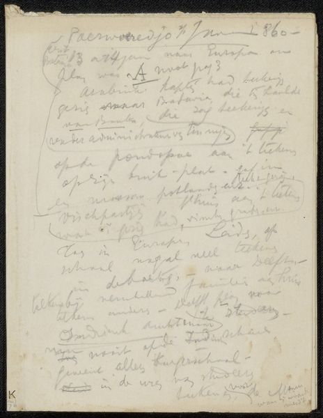
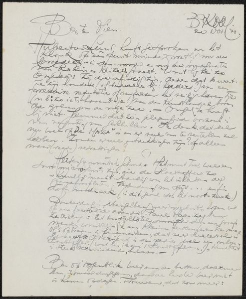
Curator: This work is titled "Brief aan jonkheer Hendrik Teding van Berkhout," possibly created in 1931 by Jo Bezaan. It’s a drawing in ink on paper, currently held at the Rijksmuseum. At first glance, the texture looks almost knitted together by lines, it creates this incredible complexity out of something very minimal. What stands out to you? Editor: How can we understand the impact of written forms upon visual aesthetics within this piece? Curator: Focus, firstly, on the stark contrast of black ink against the white ground of the paper. The formal elements create a tension, do they not? The controlled strokes of the handwriting construct a grid-like structure, which imposes order but remains somewhat fragile due to its dependence on handwritten inconsistencies. Observe how Bezaan, perhaps unintentionally, fragments space through line. The density of mark-making becomes an expressive terrain. How does this ordered-yet-chaotic aesthetic influence our understanding of its cultural function as an epistolary piece? Editor: I see what you mean. The repetition almost makes it less about the actual words and more about the pattern that it creates. Does the interplay between script and surface encourage new interpretations, or is the intention more about documenting specific messages from the past? Curator: Intention remains speculative without concrete evidence outside the work. However, by purely considering the structural elements – the contrasting marks and how the visual arrangement speaks beyond denotation–new perspectives can always emerge. The materiality—ink on paper—creates permanence whilst also illustrating its inherent fragility over time. Editor: Fascinating! It’s amazing how much can be gleaned from just the ink and paper, divorced from any specific narrative context. Curator: Indeed, a potent demonstration of form echoing content across materiality and time.
Comments
No comments
Be the first to comment and join the conversation on the ultimate creative platform.
More like this