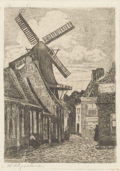
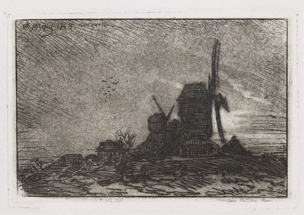
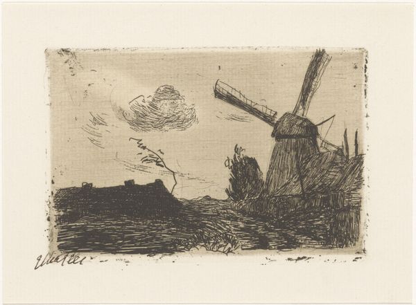
print, etching
dutch-golden-age
etching
landscape
realism
Dimensions: height 121 mm, width 90 mm
Copyright: Rijks Museum: Open Domain
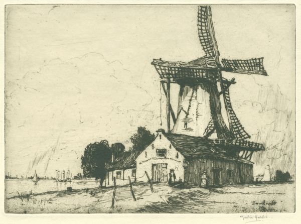
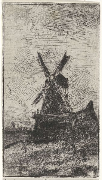
Curator: Frederika Henriëtte Broeksmit, between 1885 and 1931, created this etching entitled "Molen in Delfshaven," depicting a windmill in a landscape. Editor: My immediate response is how evocative this small print is! There's a sombre mood to the rendering; it speaks to a tradition of northern European art, though one rendered with a deft economy of line. Curator: Indeed. Broeksmit’s approach embraces realism while nodding to the Dutch Golden Age landscape tradition. One can see the influence in the attention paid to the intricacies of the mill structure itself. Editor: Absolutely. The formal organization of the image, with the windmill dominating the right side of the frame and offset by trees, presents a balanced yet dynamic interplay. Tell me more about the sociopolitical context. Was the Dutch Golden Age invoked much later during this work's creation period? Curator: These windmills at this period in the Netherlands were slowly losing their place, as these gave way to other modern technologies in an industrializing society, while still holding the nostalgia and beauty for older periods in Dutch history. You also see a slight modernization to Dutch paintings moving into the etching and print medias. Broeksmit engaged with an art scene interested in modern life but acutely aware of the past, this landscape tradition of etching brought an economic mode of disseminating art and art history for public access. Editor: And here the materiality speaks! Broeksmit makes potent the atmospheric effects of etching—those fine lines give a density to the grey, conjuring mist or oncoming rain. I am drawn to its textured appearance; a dance between dark and light that allows my eye to travel the entirety of this scene. Curator: Agreed, the varying opacities— the application of the bit—contribute significantly to its impact. Broeksmit's approach uses stark black tones alongside delicate strokes to convey volume and shadow. She seems incredibly skilled with the subtleties in etching. Editor: So many gradations—a limited palette creates remarkable spatial depth and generates feeling and presence in something small and aged, capturing a precise moment from 19th century Netherlands. Curator: Absolutely. Its nuanced composition draws the eye, encouraging one to delve deeper into the artwork's themes and artistry, beyond its subject matter. Editor: It does successfully straddle temporal realms; in some ways, it transcends history as a piece of Dutch art.
Comments
No comments
Be the first to comment and join the conversation on the ultimate creative platform.