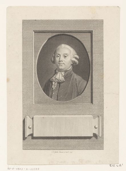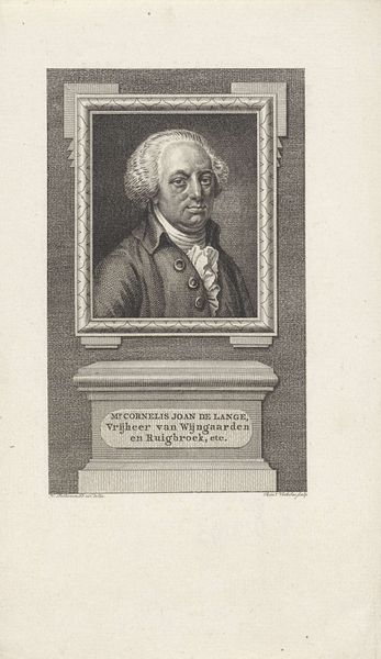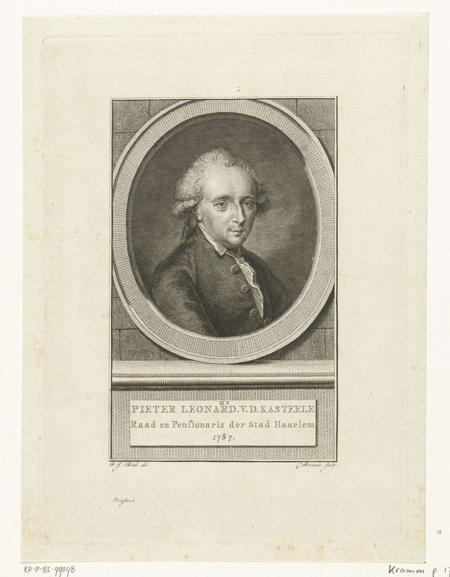
1787
Portret van Pieter Leonard van de Kasteele
Cornelis Brouwer
1735 - 1803Location
RijksmuseumListen to curator's interpretation
Curatorial notes
Editor: Here we have Cornelis Brouwer's 1787 engraving, "Portret van Pieter Leonard van de Kasteele," housed in the Rijksmuseum. The oval frame and detailed hatching give it such a refined air. What do you see in the piece, particularly considering its structure? Curator: Let's begin with the geometric organization. The artist meticulously uses an oval to contain the portrait. Observe how this contrasts with the rectangular base containing the inscription. Notice how Brouwer created a strong sense of visual hierarchy with balanced light and shadow through varying engraving textures and stroke directions. The stark black against white produces tonal precision. Editor: So, it is the precise interplay of form that defines the reading of the artwork? Curator: Indeed, the contrast between geometric shapes and the carefully modulated tonal range defines it, yes. Take note also of the oval portrait with multiple parallel lines that is framed by perpendicular, box-like corners. In my view, this creates an intellectual game as much as it does the individual features. Is Brouwer perhaps underscoring how form interacts with the illusion of the person? Editor: It seems so. This structural analysis gives so much meaning to what I had previously taken for granted in this portrait. I appreciate this perspective of understanding artworks. Curator: Likewise, your observations prove there’s always more to discover. Looking through the structure, we were able to analyze its symbolic elements by examining relationships.