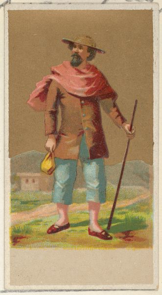
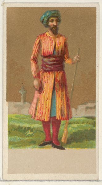
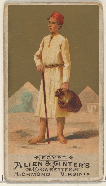
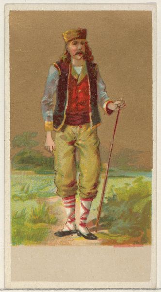
Peru, from the Natives in Costume series (N16) for Allen & Ginter Cigarettes Brands 1886
0:00
0:00
# print
#
caricature
#
portrait reference
#
coloured pencil
Dimensions: Sheet: 2 3/4 x 1 1/2 in. (7 x 3.8 cm)
Copyright: Public Domain
Editor: Here we have "Peru, from the Natives in Costume series" made in 1886, created by Allen & Ginter using drawing, coloured-pencil, and print techniques. This is interesting; it strikes me as very flat, almost like a paper doll. How should we approach it? Curator: Note how the composition foregrounds the figure against a simplified backdrop. Consider the colour palette: the muted browns and blues, punctuated by the reddish scarf, work to flatten the visual space and push the figure forward. This flattening anticipates trends in modern art. What about this flattening grabs you the most? Editor: The lack of shading definitely emphasizes the shapes, making them feel deliberate. Like the way his ochre satchel really pops, although it's a relatively subdued colour itself. The colours don’t quite align in terms of hue - there’s clashing that I can’t quite get behind. Curator: Examine how the artist has treated the outline. The crisp edges define the figure's form and lend the work a graphic quality. The bold outlines contributes to the work's visual impact despite its modest scale. How does the simplification influence your viewing experience? Editor: I see what you mean! The simplified backdrop throws the attention directly onto the human figure, making it the prime focus. I initially assumed the background and colours to be dull or unrefined. Now I appreciate it for a more considered art direction overall. Curator: Exactly! Now do you observe that the subject stares elsewhere with minimal details within? His direction of attention carries strong focalization across the scene despite its structural simplicity. The genius of colour play and bold visual construction! Editor: It is an intriguing piece that plays on surface and form rather than depth, now I can see that the focus here wasn't necessarily to showcase a portrait, but instead it was intended to utilize colour as an aesthetic composition technique.
Comments
No comments
Be the first to comment and join the conversation on the ultimate creative platform.
More like this