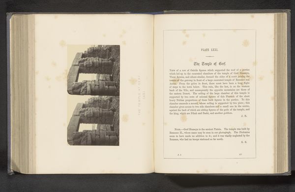
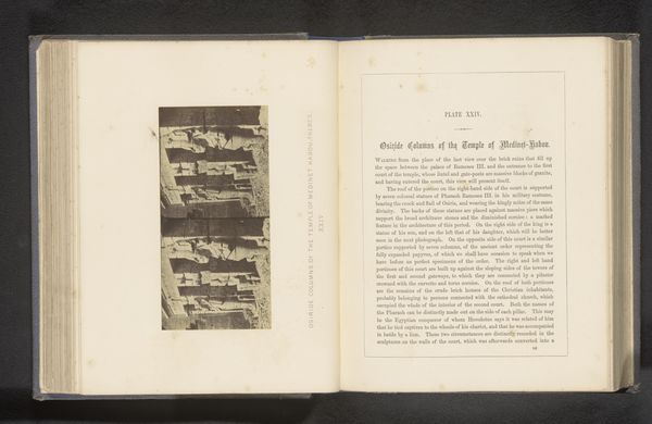
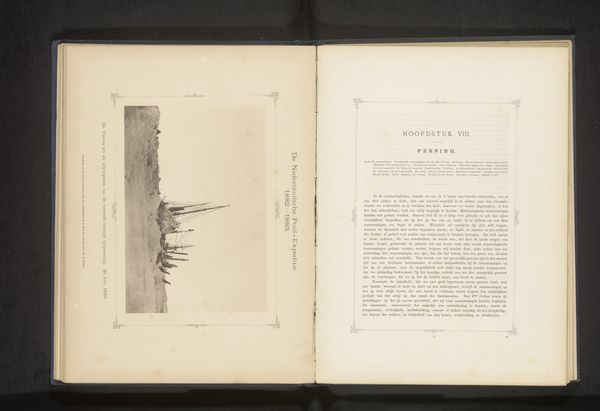
Traité pratique de phototypie ou impression à l'encre grasse sur une couche de gélatine 1879
0:00
0:00
print, photography
# print
#
photography
#
history-painting
#
academic-art
Dimensions: height 184 mm, width 120 mm, thickness 30 mm
Copyright: Rijks Museum: Open Domain
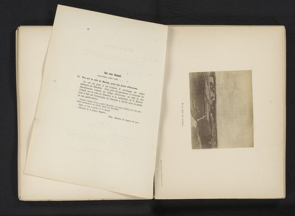
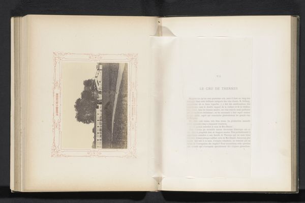
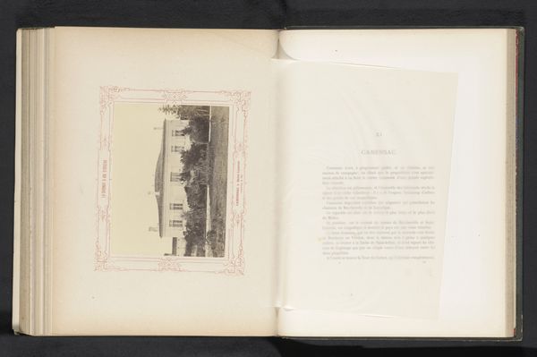
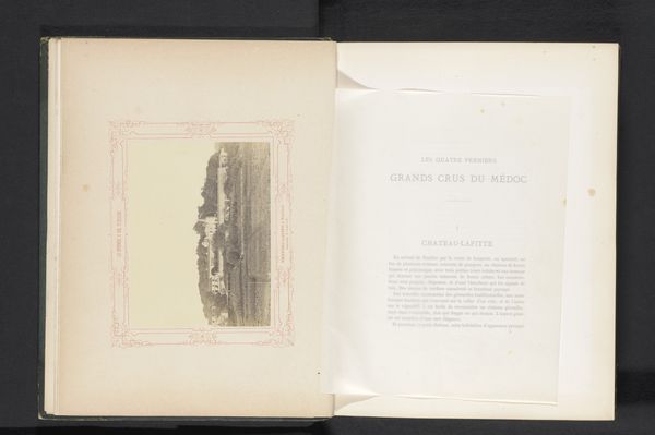
Curator: Looking at the volume before us, entitled "Trait\u00e9 pratique de phototypie ou impression \u00e0 l'encre grasse sur une couche de g\u00e9latine", or "Practical Treatise on Phototypy or Printing in Grease Ink on a Layer of Gelatin," penned by L\u00e9on Vidal in 1879, what immediately strikes you? Editor: It has such an understated elegance. The crisp typography on the title page creates a strong contrast with the hazy, almost ethereal photograph facing it, hinting at the historical weight and the experimental process involved. Curator: Exactly. Observe the compositional balance Vidal achieves between the dense text and the fading image. The placement of the title, the careful use of varying fonts—it all directs our gaze methodically across the open pages. Semiotically, we're being presented with both information and a tangible example, aren't we? Editor: Precisely. And this 'tangible example' depicting Carcassonne. Fortified cities evoke notions of defense, history, permanence… But the phototype process, rendered here, gives it this haunting, ghostly quality. It’s as if Vidal is asking us to consider how photography preserves and perhaps transforms our perception of collective memory. The sepia tones further contribute to that feeling. Curator: The choice of Carcassonne as subject is not arbitrary. Its enduring architectural presence provides a compelling counterpoint to the relatively nascent phototypy. Vidal juxtaposes the strength and steadfastness of established structures, a timeless city, with the innovation of his field. Editor: One feels the texture of the page beneath the ink. It becomes less about simple representation and more about the tangible, tactile connection to a bygone era. The gelatin silver print on the left is so very soft... I wonder if people understood then the profound shift happening with new mechanical forms of representing the world. Curator: And that tension is at the core of Vidal’s work. As much as it aims to educate on phototypy's mechanics, it prompts reflection on what this innovation means for image making and society's perception of history and truth. Editor: Thinking about the layered meaning now, what appeared initially as a quiet elegance resonates instead as a dynamic visual thesis, so to speak. I appreciate the way Vidal combined practical knowledge with artful design. Curator: A confluence we see so rarely acknowledged, perfectly captured in these pages.
Comments
No comments
Be the first to comment and join the conversation on the ultimate creative platform.
More like this