print, engraving
old engraving style
landscape
figuration
line
history-painting
engraving
realism
Dimensions: height 188 mm, width 246 mm
Copyright: Rijks Museum: Open Domain
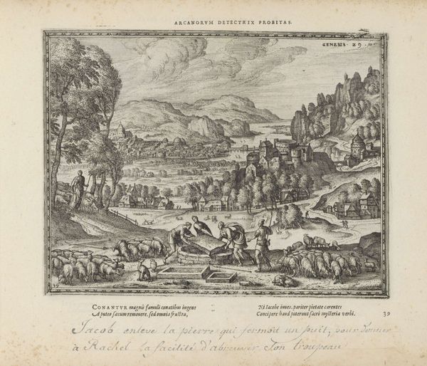
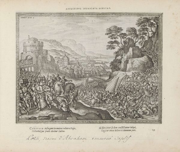
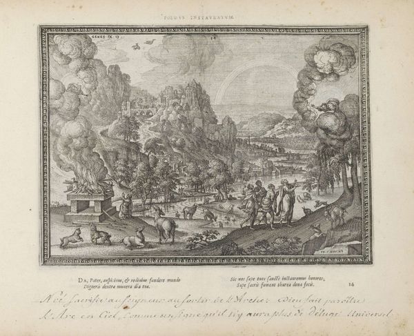
Curator: Here we have Pieter van der Borcht the Elder's "Separation of Abraham and Lot," created sometime between 1582 and 1613. This engraving offers a sweeping landscape crowded with figures and livestock. Editor: My first impression is one of separation, indeed! The figures on the rocky outcrop are dramatically isolated from the bustling activity below. The density of the scene is quite remarkable. Curator: Note how the stark lines of the engraving, while lacking the subtlety of tone we might see in a painting, create a remarkably detailed and defined composition. The separation isn't merely thematic; it's visually reinforced. Editor: Absolutely. The high vantage point lends itself to the illustration of this historical moment found in Genesis. The material consequences of their separation – land rights, resource control – reverberated across the region, influencing political structures and future conflicts. The visual hierarchy emphasizes the role of the figures atop the mountain. Curator: Precisely. See how Abraham gestures towards the landscape? It is an assertive demonstration of faith and possession. Van der Borcht meticulously renders the natural environment. The linear precision speaks to a desire to understand and codify the world. Editor: And the livestock! It is fascinating how socio-economic mobility is represented. Consider, too, the engraving's existence as a means of disseminating this narrative, imbuing the tale of Abraham and Lot with political currency. Curator: Its stark contrasts emphasize the decisiveness of the event. This is not merely a parting; it is a re-alignment. The lines dividing land, possessions, and people become indelibly marked. Editor: In light of the themes we've unpacked, I now understand the title inscription 'NON FALLAX INDICIUM', roughly 'an infallible sign'. Indeed. Curator: Quite right. A final consideration might be the implications of using an artistic method focused on exacting lines to narrate what remains an inexact promise. Editor: That's a lovely thought on which to leave our listeners. Indeed, there's far more encoded into the black and white of this engraving than initially meets the eye.
Comments
No comments
Be the first to comment and join the conversation on the ultimate creative platform.