metal, sculpture
minimalism
metal
colour-field-painting
geometric
sculpture
abstraction
pop-art
Copyright: Sven Lukin,Fair Use
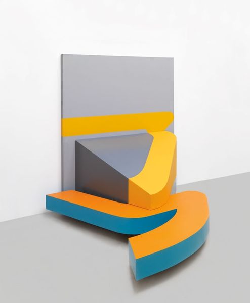
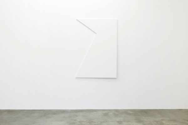
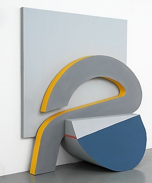
Curator: We're looking at "Pink Buttress" a metal sculpture created in 1966 by Sven Lukin. It is very characteristic of his practice during the mid-1960s. Editor: My first impression is of playful solidity. It looks simultaneously weighty and buoyant. The colour combination and smooth surface also give it a very distinct pop art vibe, wouldn't you say? Curator: Absolutely. Lukin’s work often explores the boundary between painting and sculpture, something particularly visible with this work. In the ‘60s he became well known for these large, brightly painted reliefs constructed from shaped canvas, wood, and later, like here, metal. He successfully incorporated abstraction while alluding to architectural elements. Editor: I immediately recognize the allusion to architecture; a buttress! What strikes me most, however, is how Lukin transforms that historical load-bearing symbol. Buttresses, traditionally, evoke support and stability. Here, though the title references it, the form and the color create something light, almost cartoonish. Does the sculpture carry weight, or challenge it? Curator: It challenges it by re-imagining Minimalism, I think. There’s a shared interest in geometric abstraction and the use of industrial materials, however Lukin's usage is charged with colour, where most of the recognised names of the time didn't. Editor: Colour is definitely key! The almost artificial pink paired with that vibrant blue… the two colours create such a strong emotional tone. Considering its time of creation, doesn't this colour palette capture a specific 1960s optimism and embrace of the artificial? Curator: Very astute. The colour definitely reflects the period in which it was created. The artificial colours combined with its form can evoke a dialogue with contemporary movements and tendencies, I think Pop Art comes to mind. Its architectural forms might even recall some futurist environments portrayed on television, that were equally as charged with color and unique aesthetics. Editor: Fascinating how a seemingly simple shape, a gesture in metal and paint, can resonate with such a wide range of associations. It almost encourages a double take on minimalism. Curator: Indeed. Lukin has gifted us with an incredibly engaging piece that merges architectural reference, pure form and a remarkable color scheme, encapsulating the spirit of its era and pushing beyond its artistic limits.
Comments
No comments
Be the first to comment and join the conversation on the ultimate creative platform.