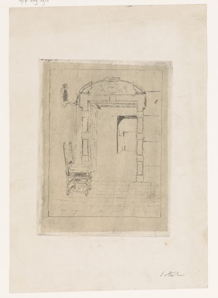
![Design for miscellaneous interior.] [Sketch of interior by Winold Reiss](/_next/image?url=https%3A%2F%2Fd2w8kbdekdi1gv.cloudfront.net%2FeyJidWNrZXQiOiAiYXJ0ZXJhLWltYWdlcy1idWNrZXQiLCAia2V5IjogImFydHdvcmtzLzE2NDM1MTM1LWMyYjgtNGFhZC05Mzg3LWNlNWYyNjNhMjRjNC8xNjQzNTEzNS1jMmI4LTRhYWQtOTM4Ny1jZTVmMjYzYTI0YzRfZnVsbC5qcGciLCAiZWRpdHMiOiB7InJlc2l6ZSI6IHsid2lkdGgiOiAxOTIwLCAiaGVpZ2h0IjogMTkyMCwgImZpdCI6ICJpbnNpZGUifX19&w=1920&q=75)
drawing, paper, pencil
#
drawing
#
aged paper
#
toned paper
#
light pencil work
#
quirky sketch
#
sketch book
#
paper
#
form
#
personal sketchbook
#
geometric
#
sketch
#
pencil
#
line
#
sketchbook drawing
#
watercolour illustration
#
storyboard and sketchbook work
#
sketchbook art
Copyright: Public Domain: Artvee
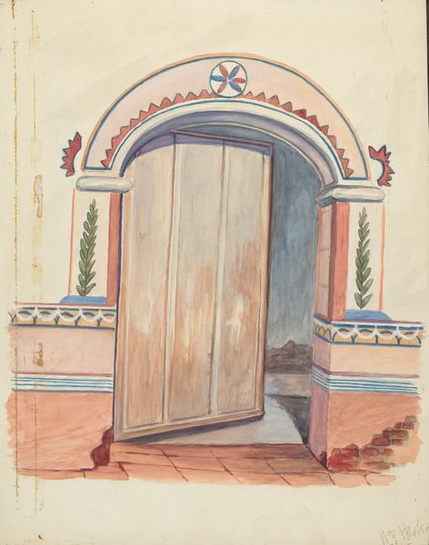
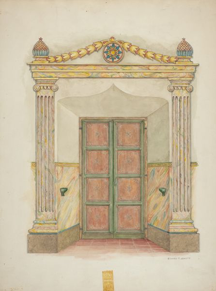
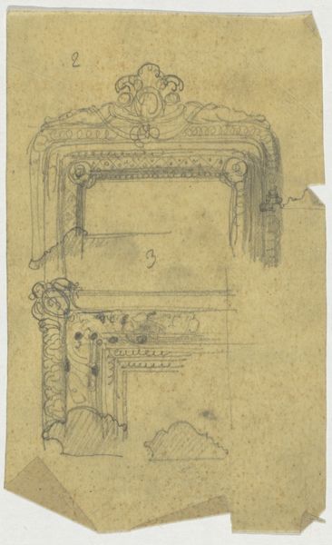
Winold Reiss made this design for a miscellaneous interior with what looks like watercolor and pencil on paper, though it’s hard to say for sure. The bright orange and green feels like a deliberate, maybe even slightly jarring choice. It makes me think about how we put colors together and what that says about us. The mark-making feels quick and intuitive, almost like doodling. You see it in the hatching of the door way, it's very free. The texture of the paper really comes through, doesn’t it? You can see all the little imperfections. It's like the drawing is breathing, alive. The way Reiss left the ground bare also feels significant. It reminds me of Matisse’s interiors. Both artists give you just enough information and then let you fill in the rest. It’s a conversation, a collaboration between the artist and the viewer.
Comments
No comments
Be the first to comment and join the conversation on the ultimate creative platform.
More like this