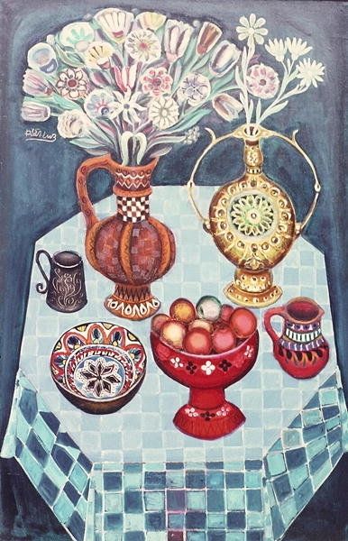
oil-paint
oil-paint
oil painting
naive art
genre-painting
realism
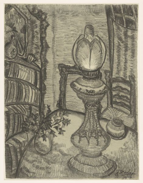
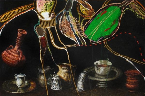
Copyright: Clarence Holbrook Carter,Fair Use
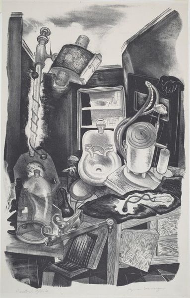
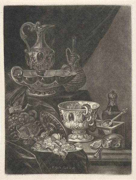
This is Clarence Holbrook Carter’s print, Antique Shop. It's a dense visual space, and almost monochromatic. The deep greens are punctuated by floral highlights. It feels like a study in stillness. Carter doesn’t allow your eye to rest, offering detail in almost every area of the picture plane. The surface is smooth, and the printing process he used—probably lithography—conceals most traces of the artist's hand. But look at the central supporting column. Carter gives us some painterly strokes that disrupt the otherwise clean, linear geometry of the composition. I feel it represents the tension between representation and abstraction. Carter’s use of cool tones and the lack of chiaroscuro or bright highlights create a feeling of compression and density. It makes me think of Giorgio Morandi's still life paintings. Like Morandi, Carter transforms everyday objects into something meditative and profound. The conversation between artists never stops, does it?
Comments
No comments
Be the first to comment and join the conversation on the ultimate creative platform.