Copyright: Public Domain: Artvee
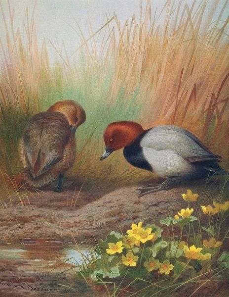
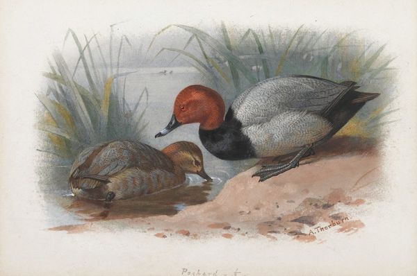
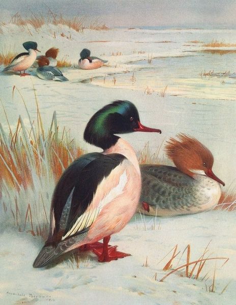
Editor: This is Archibald Thorburn’s “Ferruginous Duck,” painted in 1913. The coloring is beautiful and rich, but the ducks are placed a bit strangely in the frame; they feel isolated in a way. How do you interpret this composition? Curator: From a formal perspective, consider how the artist employs color. Notice the analogous color scheme: the prevalence of reds and browns, which creates a harmonious visual experience. This limits the color range, contributing to the artwork's overall sense of tranquility and focus. Editor: That's a good point, they really do dominate the visual field. Does this choice direct our eye in a certain way? Curator: Precisely. This chromatic uniformity is intersected by occasional greens in the plants along the lake. That helps move the eye across the visual plane. Now, consider the texture achieved by the watercolor. How does the blending and layering of pigment add to the sense of depth and dimension in what might have been a flat plane? Editor: It almost looks like a photograph through some kind of hazy lens, where objects in the far distance seem further away and muted because of the blurriness. Curator: An astute observation. The use of visual techniques lends it to a softness and almost dreamlike quality, no? The contrast created by the crisp detail in the foreground and the diffused forms of the ducks in the background directs one's eye. Editor: That makes sense, especially since this image does feel quiet and contemplative in mood. I really appreciate your attention to color and detail, it has helped me see a more dynamic organization! Curator: And I, yours on mood, particularly, how the forms create isolation within this natural scene. Thank you.
Comments
No comments
Be the first to comment and join the conversation on the ultimate creative platform.